Chapter 4 Bivariate Analysis
4.1 TL;DR: Bivariate Analysis
In Chapter 2, you learned to describe a single variable — its center, its spread, its shape. But your research question asks about two variables. Does the value of one variable tell you something about the value of another? That is the territory of bivariate analysis: exploring the relationship between a pair of variables.
Which graph you make depends on the types of your two variables. Every pair falls into one of four combinations:
| Response Variable | Explanatory Variable | Best Graph | R Code Pattern |
|---|---|---|---|
| Categorical | Categorical | Stacked bar chart, mosaic plot | geom_bar(position = "fill") or mosaic() from vcd |
| Quantitative | Categorical | Side-by-side boxplots, violin plots | geom_boxplot() or geom_violin() |
| Quantitative | Quantitative | Scatter plot with trend line | geom_point() + geom_smooth(method = "lm") |
| Categorical | Quantitative | Logistic scatter plot | geom_point() + stat_smooth(method = "glm", ...) |
Here are quick examples of all four, using the NESARC dataset (young adult daily smokers):
library(ggplot2)
library(dplyr)
library(vcd)

# Load the full NESARC survey (43,093 adults × 3,008 variables)
NESARC <- read.csv("NESARC.csv")

# Build the subset we use throughout the book:
# young adult (≤25) daily smokers with valid nicotine dependence data
nesarc <- NESARC %>%
  filter(
    S3AQ1A == 1,         # smoked 100+ cigarettes in lifetime
    S3AQ3B1 == 1,        # smoked in past 12 months
    CHECK321 == 1,       # valid nicotine dependence data
    AGE <= 25             # young adults only
  ) %>%
  rename(
    Ethnicity          = ETHRACE2A,
    Age                = AGE,
    MajorDepression    = MAJORDEPLIFE,
    TobaccoDependence  = TAB12MDX,
    DailyCigsSmoked    = S3AQ3C1,
    Sex                = SEX
  ) %>%
  select(Ethnicity, Age, MajorDepression, TobaccoDependence, DailyCigsSmoked, Sex)

# Code 99 as missing (99 = "unknown" in the NESARC code book)
nesarc$DailyCigsSmoked[nesarc$DailyCigsSmoked == 99] <- NA

# Label factor variables with readable names
nesarc$TobaccoDependence <- factor(nesarc$TobaccoDependence,
  labels = c("No Dependence", "Nicotine Dependence"))
nesarc$Sex <- factor(nesarc$Sex,
  labels = c("Female", "Male"))
nesarc$MajorDepression <- factor(nesarc$MajorDepression,
  labels = c("No Depression", "Yes Depression"))
# C → C: Stacked bar chart (depression × nicotine dependence)
ggplot(data = nesarc, aes(x = MajorDepression, fill = TobaccoDependence)) +
geom_bar(position = "fill") +
theme_bw() +
labs(x = "", y = "Proportion",
title = "Nicotine Dependence by Depression Status") +
scale_fill_manual(values = c("#619CFF", "#F8766D"),
name = "Nicotine\nDependence")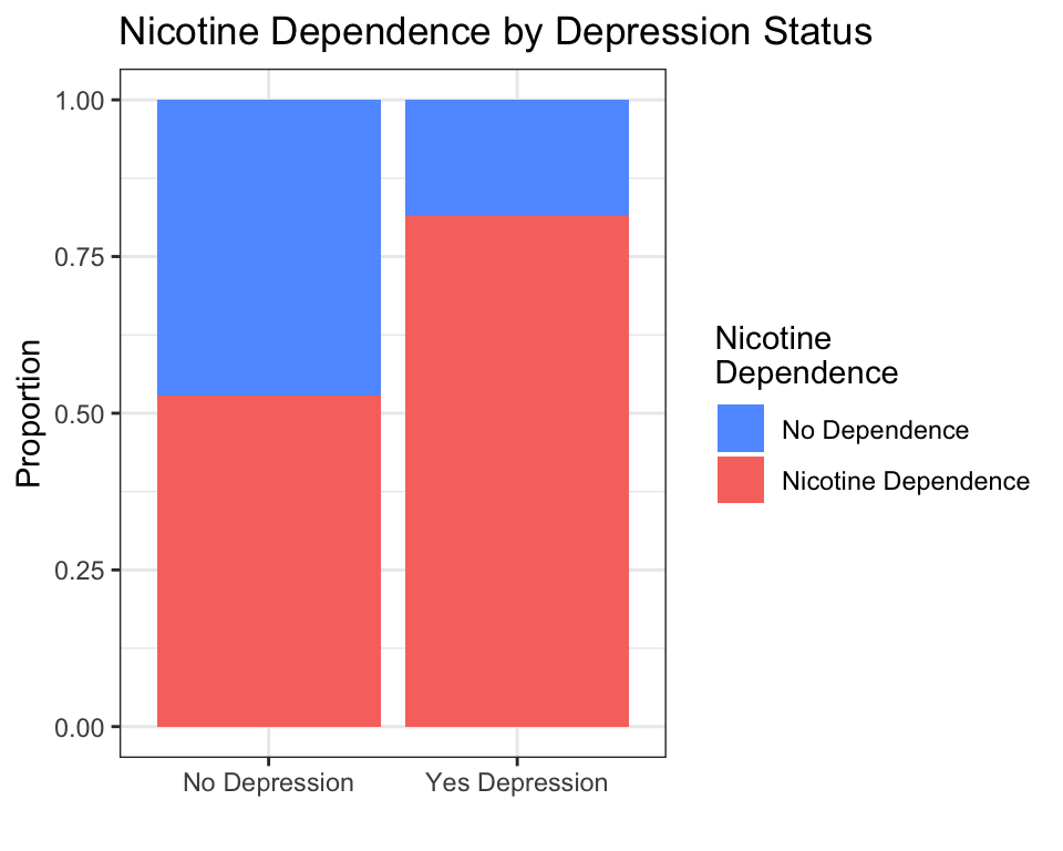
Interpretation: Among young adult daily smokers, those with depression show a higher proportion of nicotine dependence than those without depression.
# C → Q: Boxplot (sex × daily cigarettes smoked)
ggplot(data = nesarc, aes(x = Sex, y = DailyCigsSmoked)) +
  geom_boxplot(fill = "#619CFF") +
  theme_bw() +
  labs(x = "", y = "Daily Cigarettes Smoked",
       title = "Daily Cigarette Consumption by Sex")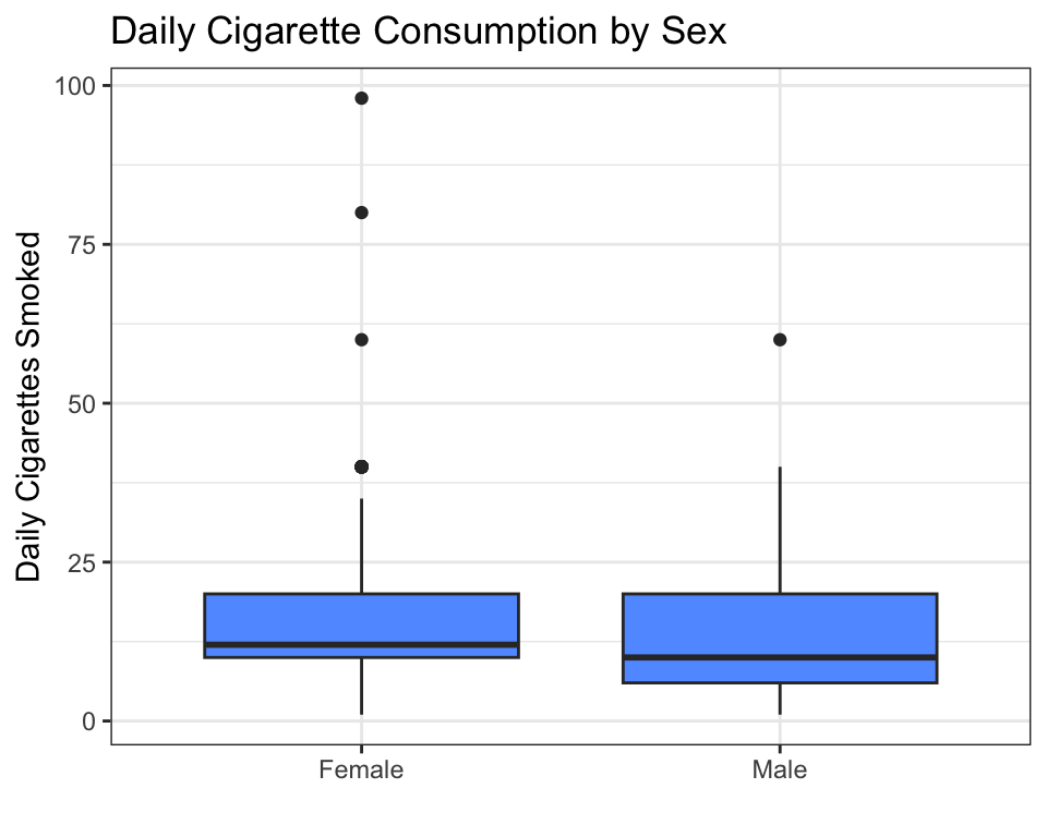
Interpretation: The median daily cigarette count looks similar between females and males, but the spread (and the high-end outliers) differ.
# Q → Q: Scatter plot (age × daily cigarettes)
ggplot(data = nesarc, aes(x = Age, y = DailyCigsSmoked)) +
  geom_point(alpha = 0.4, color = "#619CFF") +
  geom_smooth(method = "lm", se = FALSE, color = "#F8766D") +
  theme_bw() +
  labs(x = "Age (years)", y = "Daily Cigarettes Smoked",
       title = "Age vs. Daily Cigarette Consumption")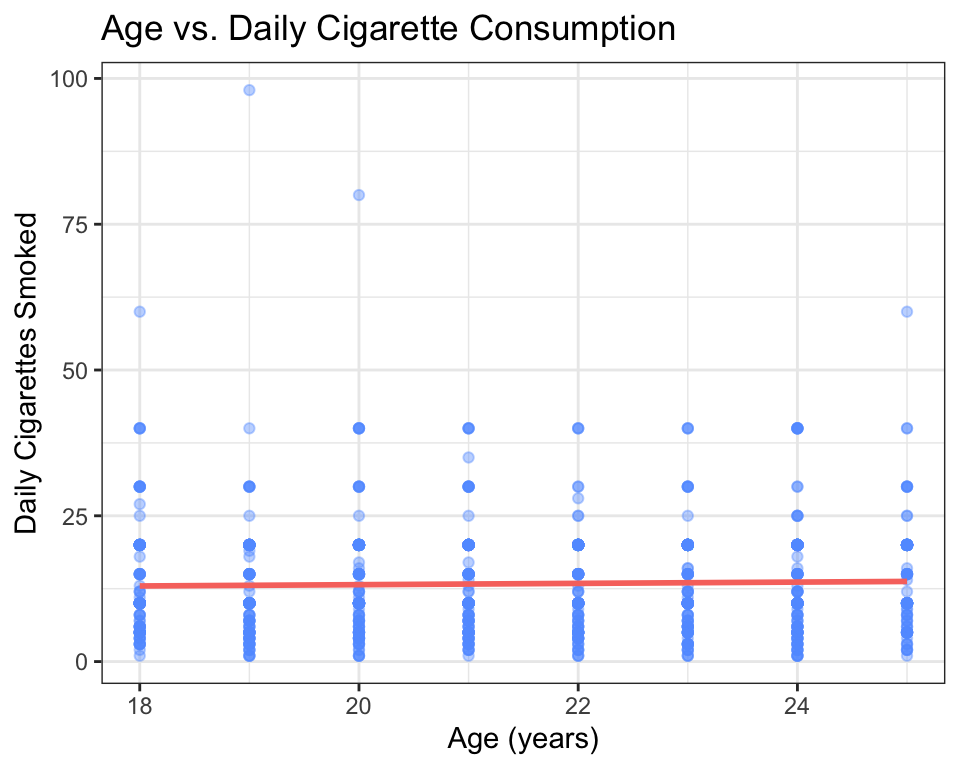
Interpretation: There is a weak positive trend — older young adults tend to smoke slightly more cigarettes per day, but the relationship is not strong (the points are very spread out).
# Q → C: Logistic scatter (daily cigarettes → nicotine dependence)
# Create a numeric version of the dependence variable
nesarc$TobaccoDependenceN <- ifelse(nesarc$TobaccoDependence == "Nicotine Dependence", 1, 0)

ggplot(data = nesarc, aes(x = DailyCigsSmoked, y = TobaccoDependenceN)) +
  geom_point(alpha = 0.3, color = "#619CFF") +
  stat_smooth(method = "glm", method.args = list(family = "binomial"),
              se = TRUE, color = "#F8766D") +
  theme_bw() +
  labs(x = "Daily Cigarettes Smoked", y = "Probability of Dependence",
       title = "Cigarettes Smoked vs. Nicotine Dependence")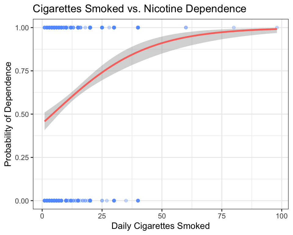
Interpretation: The curve rises sharply — as daily cigarette consumption increases, the probability of being nicotine-dependent increases quickly, then levels off near 1.0 for heavy smokers.
Key takeaway: For any pair of variables, ask yourself: “What types are they?” Pick the matching graph from the table above. The graph will reveal the pattern — or the lack of one — instantly.
4.2 Deep Dive: Bivariate Analysis
4.2.1 Why Compare Two Variables?
In Chapter 2, you learned to summarize a single variable using frequency tables, histograms, means, and medians. That is an essential skill — but it only answers questions like “What is the average test score in this class?” or “What proportion of students prefer morning classes?”
Your research question almost certainly asks about two variables together. Look at the questions you might have asked in Chapter 1:
- Is there a relationship between the number of cigarettes a person smokes per day and their level of nicotine dependence?
- Are adults with higher education levels less likely to be diagnosed with depression?
- Do income levels differ between ethnic groups?
Each of these questions compares one variable to another. The first variable (nicotine dependence, depression diagnosis, income) is what you are trying to explain or predict. The second variable (cigarettes per day, education level, ethnicity) is what you think might explain or predict it.
In statistical language, we call these:
- The response variable (also called the dependent variable or outcome): the thing you are trying to understand or predict.
- The explanatory variable (also called the independent variable or predictor): the thing you think might be associated with the response.
For example, if your research question is “Does daily cigarette consumption predict nicotine dependence?”, then:
- Response: Nicotine dependence (categorical: No Dependence / Nicotine Dependence)
- Explanatory: Daily cigarettes smoked (quantitative: a number from 1 to 98+)
Deciding which variable plays which role is not always obvious from the data alone. Sometimes you impose a causal model — you decide, based on logic or theory, which variable you think influences the other. In the example above, it makes more sense that cigarette consumption could lead to dependence, not the other way around.
Here is a practical trick when you are stuck: ask yourself, “If I could run an experiment, which variable would I change, and which would I measure as the outcome?” If you could make someone sleep 8 hours instead of 5, would you expect their test score to change? Probably yes — so Sleep is the explanatory variable and Test Score is the response. If you changed someone’s test score (something you cannot actually do), would their sleep habits change? Probably not. The variable you can imagine intervening on is your explanatory variable; the one you would expect to respond is your response variable. If neither direction makes more sense, or if both directions are plausible, then your research question itself determines the roles — you are the one asking the question, so you decide what you are trying to explain.
For the purposes of graphing, the rule is simple: the explanatory variable goes on the x-axis, and the response variable goes on the y-axis. This convention makes your graphs immediately readable by anyone trained in statistics.
4.2.2 The Four Combinations
Every pair of variables falls into one of four types, based on whether each variable is categorical or quantitative. Here is a summary:
| Response | Explanatory | Notation | Best Graph |
|---|---|---|---|
| Categorical | Categorical | C → C | Stacked bar chart, mosaic plot |
| Quantitative | Categorical | C → Q | Side-by-side boxplots, violin plots |
| Quantitative | Quantitative | Q → Q | Scatter plot (with optional trend line) |
| Categorical | Quantitative | Q → C | Logistic scatter plot |
Let us walk through each combination, using the NESARC dataset. By the end of this section, you will have a graph for your own research question.
Important: The code in the TL;DR section above loads the full NESARC survey and builds the
nesarcsubset — young adult daily smokers — that we use throughout this chapter. Make sureNESARC.csvis in your project folder (downloaded once, as described in Chapter 3) and run the setup code before the examples that follow.
4.2.3 C → C: Comparing Two Categorical Variables
When both your response and explanatory variables are categorical, you are comparing proportions across groups. For example:
- Does the proportion of nicotine-dependent smokers differ between people with and without depression?
- Is the proportion of students who prefer morning classes different between grade levels?
4.2.3.1 Stacked Bar Charts
The simplest way to visualize C → C relationships is with a stacked bar chart. Each bar represents one category of the explanatory variable (e.g., “No Depression” and “Yes Depression”). Inside each bar, color segments show the proportions of the response variable (e.g., “No Dependence” in blue, “Nicotine Dependence” in red).
ggplot(data = nesarc, aes(x = MajorDepression, fill = TobaccoDependence)) +
  geom_bar(position = "fill") +
  theme_bw() +
  labs(x = "", y = "Proportion",
       title = "Nicotine Dependence by Depression Status\n(Young Adult Daily Smokers, NESARC)") +
  scale_fill_manual(values = c("#619CFF", "#F8766D"),
                    name = "Nicotine\nDependence")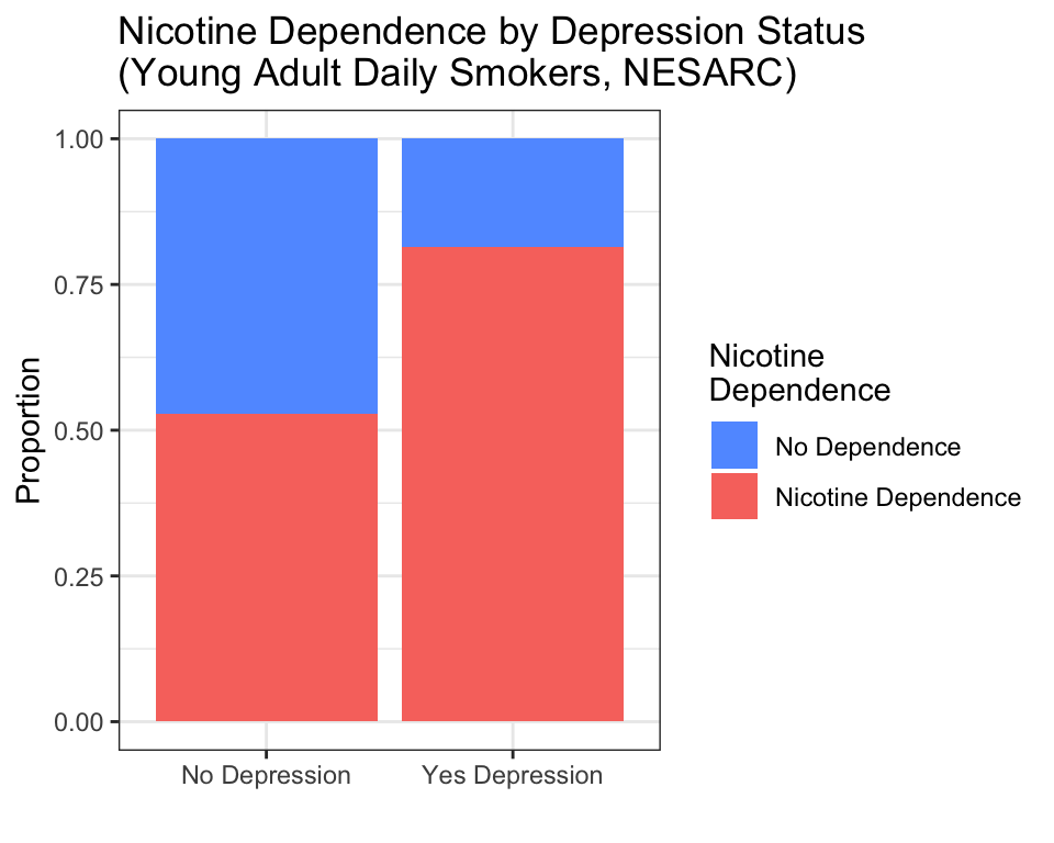
How to read this graph:
- The height of each bar is always 1.0 (100% of the group).
- Within the “No Depression” bar, roughly 60% are nicotine-dependent (red) and 40% are not (blue).
- Within the “Yes Depression” bar, roughly 75% are nicotine-dependent (red) and 25% are not (blue).
- The pattern: depression is associated with a higher rate of nicotine dependence among young adult daily smokers.
The key phrase position = "fill" tells ggplot2 to stretch each bar to the same height (100%) and show proportions, not raw counts. Without position = "fill", you would get a stacked bar chart with different total heights — harder to compare proportions across groups.
You may have noticed that the bar chart code does not include a y aesthetic — unlike the scatter plot, which had y = DailyCigsSmoked. For bar charts, geom_bar() automatically counts how many observations fall into each combination of categories. You only need to tell it what goes on the x-axis (MajorDepression) and what determines the fill color (TobaccoDependence). R handles the counting for you.
4.2.3.2 Mosaic Plots
A mosaic plot is a more sophisticated version of the stacked bar chart. Instead of bars, it uses rectangles whose area is proportional to the count in each cell of the table. The vcd package (Visualizing Categorical Data) makes mosaic plots easy:
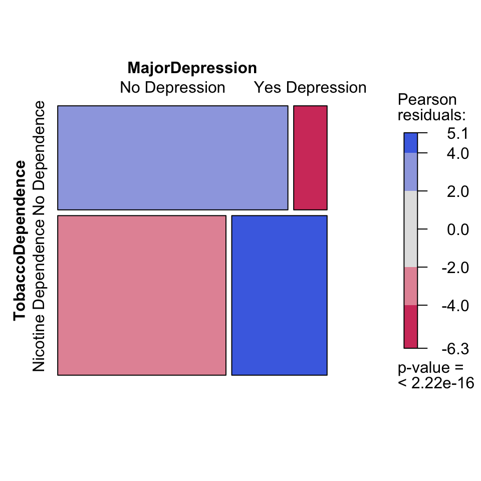
How to read a mosaic plot:
- The width of each column is proportional to the number of people in that group (more people have “No Depression” than “Yes Depression” — so the left column is wider).
- The height of each rectangle within a column shows the proportion within that group.
- Blue shading indicates cells where the observed count is higher than expected under independence (more nicotine dependence among depressed smokers).
- Red shading indicates cells where the observed count is lower than expected (less nicotine dependence among non-depressed smokers).
The formula syntax is mosaic(~ Response + Explanatory, data = ...). Note that the response variable comes first inside the formula — this is the opposite of ggplot2, where the explanatory variable goes on the x-axis.
4.2.3.3 Which Graph Should You Use?
Both graphs convey the same information. The stacked bar chart is simpler and easier for general audiences to understand. The mosaic plot is better for detecting whether the association is statistically meaningful (the shading helps), but it takes practice to read. For your own project, start with the stacked bar chart. Add a mosaic plot if you need a second perspective.
4.2.4 C → Q: Categorical Explanatory, Quantitative Response
When your explanatory variable is categorical and your response is quantitative, you are comparing the distribution of a number across groups. For example:
- Do daily cigarette consumption levels differ between females and males?
- Are math test scores different across grade levels?
- Does the number of hours slept per night differ between students who exercise and students who do not?
4.2.4.1 Boxplots
A boxplot (also called a box-and-whisker plot) is the standard tool for C → Q comparisons. It shows five key numbers for each group: the minimum, the first quartile (25th percentile), the median (50th percentile), the third quartile (75th percentile), and the maximum.
ggplot(data = nesarc, aes(x = Sex, y = DailyCigsSmoked)) +
  geom_boxplot(fill = "#619CFF") +
  theme_bw() +
  labs(x = "", y = "Daily Cigarettes Smoked",
       title = "Daily Cigarette Consumption by Sex")
How to read a boxplot:
- The thick horizontal line inside each box is the median — half the people smoke less, half smoke more. For both females and males, the median is around 10 cigarettes per day.
- The box spans from the first quartile (Q1, bottom edge) to the third quartile (Q3, top edge). The middle 50% of the data lies inside the box. This is called the interquartile range (IQR).
- The whiskers extend to the most extreme data point that is not an outlier (within 1.5 × IQR from the box edges).
- The dots above the whiskers are outliers — individuals who smoke far more than the typical person in their group.
- If one box sits noticeably higher than another, the medians differ — suggesting the explanatory variable is associated with the response.
In this example, the medians are similar, but the male group shows more high-end outliers (some males smoke 60+ cigarettes per day).
4.2.4.2 Violin Plots
A violin plot shows the same information as a boxplot, but with more detail about the shape of the distribution. Instead of a box, the plot draws a “violin” shape — wider where more data points are concentrated, narrower where they are sparse.
ggplot(data = nesarc, aes(x = Sex, y = DailyCigsSmoked)) +
  geom_violin(fill = "#619CFF") +
  theme_bw() +
  labs(x = "", y = "Daily Cigarettes Smoked",
       title = "Daily Cigarette Consumption by Sex")
How to read a violin plot:
- The width of the shape at any point shows how many people have that value. A wide bulge means many people cluster around that number.
- Both groups are right-skewed — the bulge is near 10 cigarettes, with a long tail stretching to the right. Most young adult smokers consume 5–20 cigarettes per day; a few consume much more.
- If the shapes are centered at different heights, the groups differ.
Violin plots are best when you have enough data to reveal the shape. For very small samples (fewer than 30 per group), a boxplot may be clearer.
4.2.5 Q → Q: Two Quantitative Variables
When both variables are quantitative, a scatter plot is your tool. Each point on the plot represents one observation (one person, in the NESARC dataset). The x-coordinate is the explanatory variable; the y-coordinate is the response.
ggplot(data = nesarc, aes(x = Age, y = DailyCigsSmoked)) +
  geom_point(alpha = 0.4, color = "#619CFF") +
  theme_bw() +
  labs(x = "Age (years)", y = "Daily Cigarettes Smoked",
       title = "Age vs. Daily Cigarette Consumption\n(Young Adult Daily Smokers, NESARC)")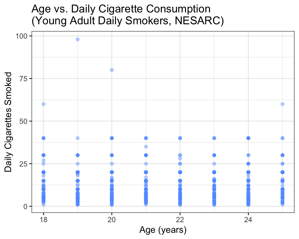
How to read a scatter plot:
- Each dot is one person. The dot’s position tells you that person’s age (horizontal) and daily cigarette count (vertical).
- Look for a pattern. Do the dots trend upward (positive association), downward (negative association), or scatter randomly (no association)?
- Look for outliers. Are there individual points that are far from the general cloud?
- Look for clusters. Do the points form distinct groups?
In this plot, the pattern is weak — there is a slight upward trend (older young adults smoke slightly more), but the points are widely scattered. That tells you age alone does not explain much of the variation in cigarette consumption.
4.2.5.1 Adding a Trend Line
To make the pattern easier to see, add a trend line using geom_smooth():
ggplot(data = nesarc, aes(x = Age, y = DailyCigsSmoked)) +
  geom_point(alpha = 0.4, color = "#619CFF") +
  geom_smooth(method = "lm", se = FALSE, color = "#F8766D", linewidth = 1.2) +
  theme_bw() +
  labs(x = "Age (years)", y = "Daily Cigarettes Smoked",
       title = "Age vs. Daily Cigarette Consumption\n(with linear trend)")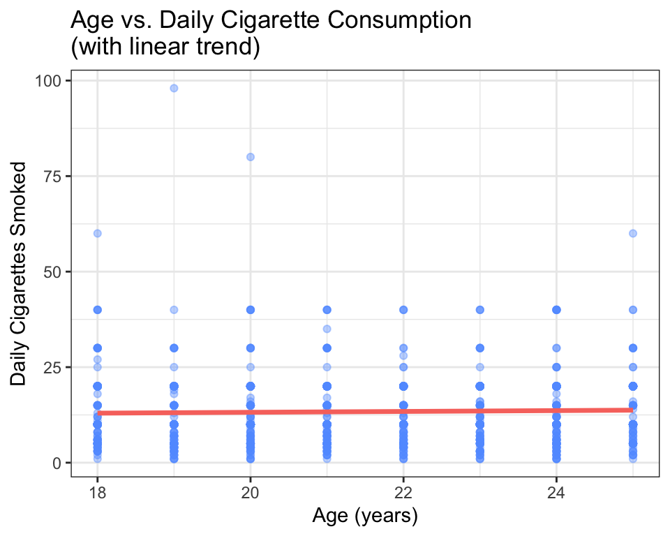
The red line is a least-squares regression line — the straight line that comes closest to all the points on average. The argument method = "lm" tells R to fit a linear model. You will learn much more about linear models in Chapters 9 and 10.
How to read the trend line:
- If the line slopes upward, the association is positive — as the explanatory variable increases, the response tends to increase.
- If the line slopes downward, the association is negative.
- If the line is nearly flat, there is little to no linear association.
- The steepness of the slope tells you the strength of the association (steeper = stronger per-unit effect).
In this case, the line slopes slightly upward — about 0.15 more cigarettes per day for each additional year of age. This is a small association, which matches what we saw in the raw scatter.
A note about
alphaand large datasets: In scatter plots with many overlapping points, usealpha = 0.4(or lower) to make points semi-transparent. Darker areas show where many points are stacked on top of each other. This is especially helpful with the NESARC data, which has over a thousand young adult smokers.What if even
alpha = 0.1is not enough — say, with 50,000+ points? Researchers have several additional strategies:
- 2D density plots (
geom_density_2d()) replace individual dots with contour lines showing where points concentrate — like a topographic map of your data.- Hexagonal binning (
geom_hex()from thehexbinpackage) divides the plot into hexagons and colors them by how many points fall inside — essentially a two-dimensional histogram.- Random subsampling — plot a random 1,000–2,000 points instead of all 50,000. The pattern visible in a random subset is almost always the same as the full dataset, and the plot renders instantly.
For the NESARC data,
alpha = 0.3is usually enough. If your own project involves much larger datasets, you now know your options.
4.2.6 Q → C: Quantitative Explanatory, Categorical Response
What if your explanatory variable is quantitative and your response is categorical? For example:
- Does the number of cigarettes smoked per day predict whether someone is nicotine-dependent?
- Does a student’s study hours per week predict whether they pass a particular exam?
This combination is less common in exploratory analysis, but it is an important setup for logistic regression, which you will learn in Chapter 11. For now, here is what the graph looks like:
ggplot(data = nesarc, aes(x = DailyCigsSmoked, y = TobaccoDependenceN)) +
  geom_point(alpha = 0.3, color = "#619CFF") +
  stat_smooth(method = "glm", method.args = list(family = "binomial"),
              se = TRUE, color = "#F8766D") +
  theme_bw() +
  labs(x = "Daily Cigarettes Smoked", y = "Probability of Nicotine Dependence",
       title = "Cigarette Consumption vs. Nicotine Dependence")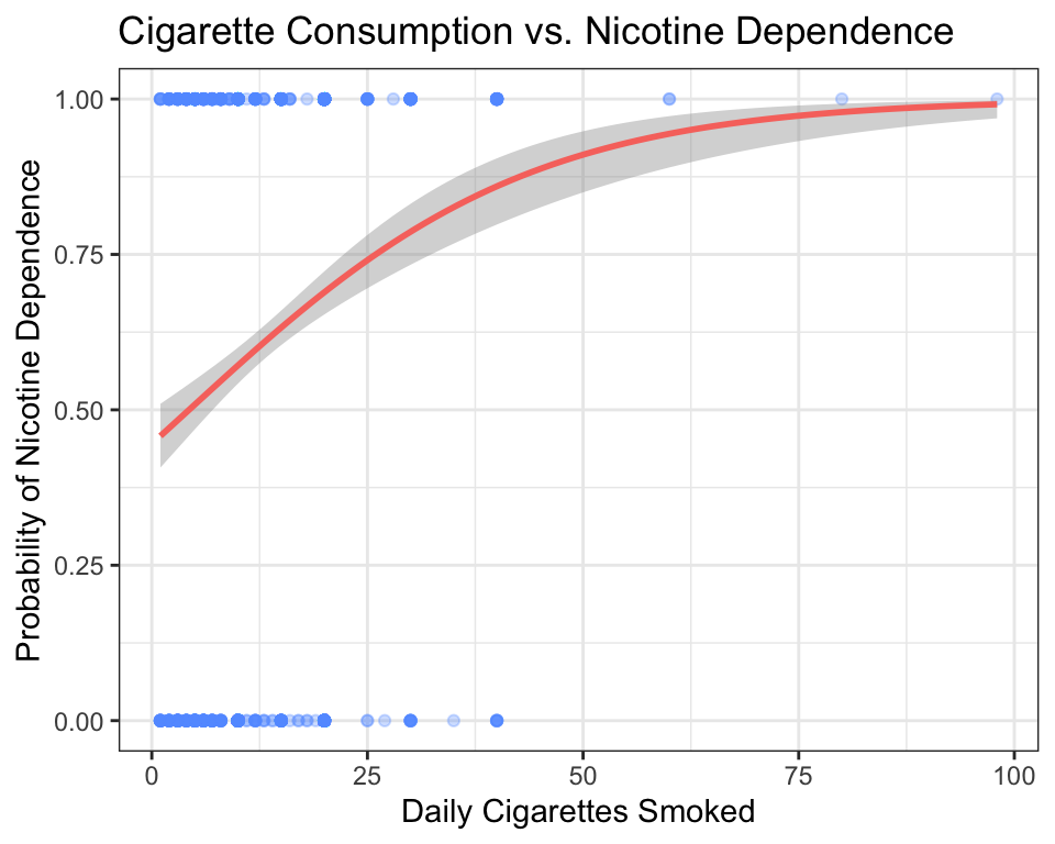
How to read this graph:
- The y-axis shows the probability of the response being “Yes” (Nicotine Dependence = 1).
- The raw data points are at y = 0 (No Dependence) and y = 1 (Nicotine Dependence). They are jittered vertically by
alphato show density. - The red S-shaped curve is a logistic regression fit. It shows how the predicted probability of nicotine dependence changes as daily cigarette consumption increases.
- At low cigarette counts (0–5 per day), the probability of dependence is low (near 0.1).
- By 20 cigarettes per day, the probability has climbed above 0.75.
- The curve levels off near 1.0 — heavy smokers are almost all nicotine-dependent.
A careful reader might ask: what does it mean for the curve to pass through 0.75? Does that mean a specific person is “75% addicted”? No. The curve describes groups, not individuals. If you randomly selected 100 young adult daily smokers who each consume 20 cigarettes per day, you would expect about 75 of them to be nicotine-dependent. The y-axis shows the proportion of people at each value of the explanatory variable, not a measurement taken on a single person. Think of the S-curve as answering: “Out of everyone who smokes X cigarettes per day, what fraction are dependent?”
This type of plot is a preview. In Chapter 7 (Chi-Square Tests) and Chapter 11 (Moderation & Extensions), you will learn formal methods for testing and modeling this kind of relationship. For now, simply recognize the pattern: as the quantitative variable increases, the probability of the categorical outcome shifts.
4.2.7 Adding a Third Variable: Multivariate Graphs
Life is rarely as simple as “X causes Y.” There is almost always a third variable that influences the relationship you are studying. In the NESARC dataset, Sex is a natural third variable — maybe the association between depression and nicotine dependence looks different for females and males.
To explore this, you can facet your graph — split it into separate panels, one for each level of a third variable:
ggplot(data = nesarc, aes(x = MajorDepression, fill = TobaccoDependence)) +
  geom_bar(position = "fill") +
  theme_bw() +
  labs(x = "", y = "Proportion",
       title = "Nicotine Dependence by Depression Status\n(Split by Sex)") +
  scale_fill_manual(values = c("#619CFF", "#F8766D"),
                    name = "Nicotine\nDependence") +
  facet_grid(Sex ~ .)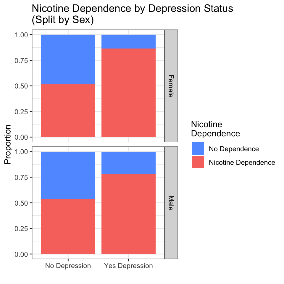
How to read a faceted graph:
- Each row (or column) is a separate group defined by the third variable. Here, the top panel shows females; the bottom panel shows males.
The formula Sex ~ . tells facet_grid() to split by Sex on the rows (vertical stacking) and put nothing on the columns. The dot . means “no variable here.” If you used facet_grid(. ~ Sex), the panels would sit side by side in columns instead of stacked in rows — same data, different layout. When your third variable has many categories (like Ethnicity with five groups), columns often work better because the panels do not become too short. The choice is purely about readability.
- Compare the pattern across panels. Does the relationship look similar in both groups, or does it change?
- In this case, the pattern is similar: for both females and males, depression is associated with a higher proportion of nicotine dependence. The third variable (Sex) does not dramatically change the story.
- If the pattern did change — for example, if depression were associated with dependence only in females but not in males — that would be a moderation effect or interaction, which you will study in Chapter 11.
You can also use facet_wrap() to create a grid of panels, especially when the third variable has many categories. The syntax is nearly identical:
This would split the graph into five panels, one for each ethnic group.
Key idea: Adding a third variable is one of the simplest and most powerful things you can do to deepen your analysis. It does not require a new statistical test — just a new line of ggplot2 code. Always ask yourself: “What other variable might influence this relationship?” Then facet by it and see what you learn.
4.2.8 Common Mistakes Students Make
Putting variables on the wrong axes. The explanatory variable goes on the x-axis (horizontal), the response variable goes on the y-axis (vertical). This is a convention, not a rule of mathematics, but getting it backwards confuses readers.
Using the wrong graph for the variable types. A scatter plot of a categorical variable (C → C) is meaningless — the points will stack on top of each other at a few discrete positions. A boxplot of two quantitative variables (Q → Q) throws away the pairing between values. Always check: what type are my variables?
Forgetting to read the code book. Before you graph, make sure you understand what each variable means. Graphing “Education” coded as 1–14 without knowing that 9 means “missing” will produce nonsense.
Ignoring
alphain large datasets. When you have thousands of points, a scatter plot without transparency becomes a solid blob. Usealpha = 0.3oralpha = 0.5to reveal density.Confusing
position = "fill"withposition = "stack". In a stacked bar chart for C → C comparisons, always useposition = "fill"so the bars are all the same height and you compare proportions.position = "stack"(the default) makes bars with different heights, which is harder to interpret.Forgetting to label axes. The default variable names from your dataset (like
S3AQ3C1) mean nothing to a reader. Always uselabs(x = "...", y = "...", title = "...")to make your graph self-explanatory.
4.2.9 What Comes Next
In this chapter, you learned to graph the relationship between two variables using the appropriate visualization for each variable-type combination. You can now produce professional-quality graphs for any pair of variables in the NESARC dataset — or any dataset you encounter in the future.
But graphing only tells you part of the story. A graph shows you a pattern. It does not tell you whether that pattern is real (a genuine feature of the population) or just noise (an accident of the particular sample you happen to have). The difference between pattern and noise is the central question of statistical inference.
In Chapter 5 (Hypothesis Testing), you will learn the logic of making decisions with data. You will ask: “If there were truly no association between depression and nicotine dependence in the population, how likely would I be to see the pattern I observed in my sample?” The answer — the p-value — will tell you whether your graph is showing something meaningful or just a random fluctuation.