Chapter 8 Correlation — Measuring Relationships
8.1 TL;DR: Correlation
- Correlation measures the strength and direction of a linear relationship between two quantitative variables. The correlation coefficient \(r\) ranges from \(-1\) (perfect negative) to \(+1\) (perfect positive).
- Always graph first. If the scatter plot curves, \(r\) will mislead you. Look for direction, form, strength, and outliers before computing any number.
- \(R^2 = r^2\) is the coefficient of determination — the proportion of variability in the response explained by the explanatory variable. It tells you practical importance.
- The hypothesis test asks: “Is there evidence of a linear relationship in the population?” \(H_0\): \(\rho = 0\). Use
cor.test()to get the p-value. The 4-step process is identical to Chapter 5. - Correlation \(\neq\) causation. A strong \(r\) means two variables move together — it does NOT prove one causes the other.
# Load the highway sign study — 30 drivers, Age and reading Distance
# ← REPLACE: your file path
signdist <- read.csv("signdist.csv")

# Always graph first — scatter plot with trend line
library(ggplot2)
ggplot(data = signdist, aes(x = Age, y = Distance)) +       # ← REPLACE: x, y = your variables
  geom_point(color = "#619CFF", size = 2.5) +                # each point = one observation
  stat_smooth(method = "lm", se = TRUE,                      # add linear trend + confidence band
              color = "#F8766D", linewidth = 1.2) +
  theme_bw() +                                                # clean black-and-white theme
  labs(x = "Driver's Age (years)",                            # ← REPLACE: your axis labels
       y = "Maximum Reading Distance (feet)")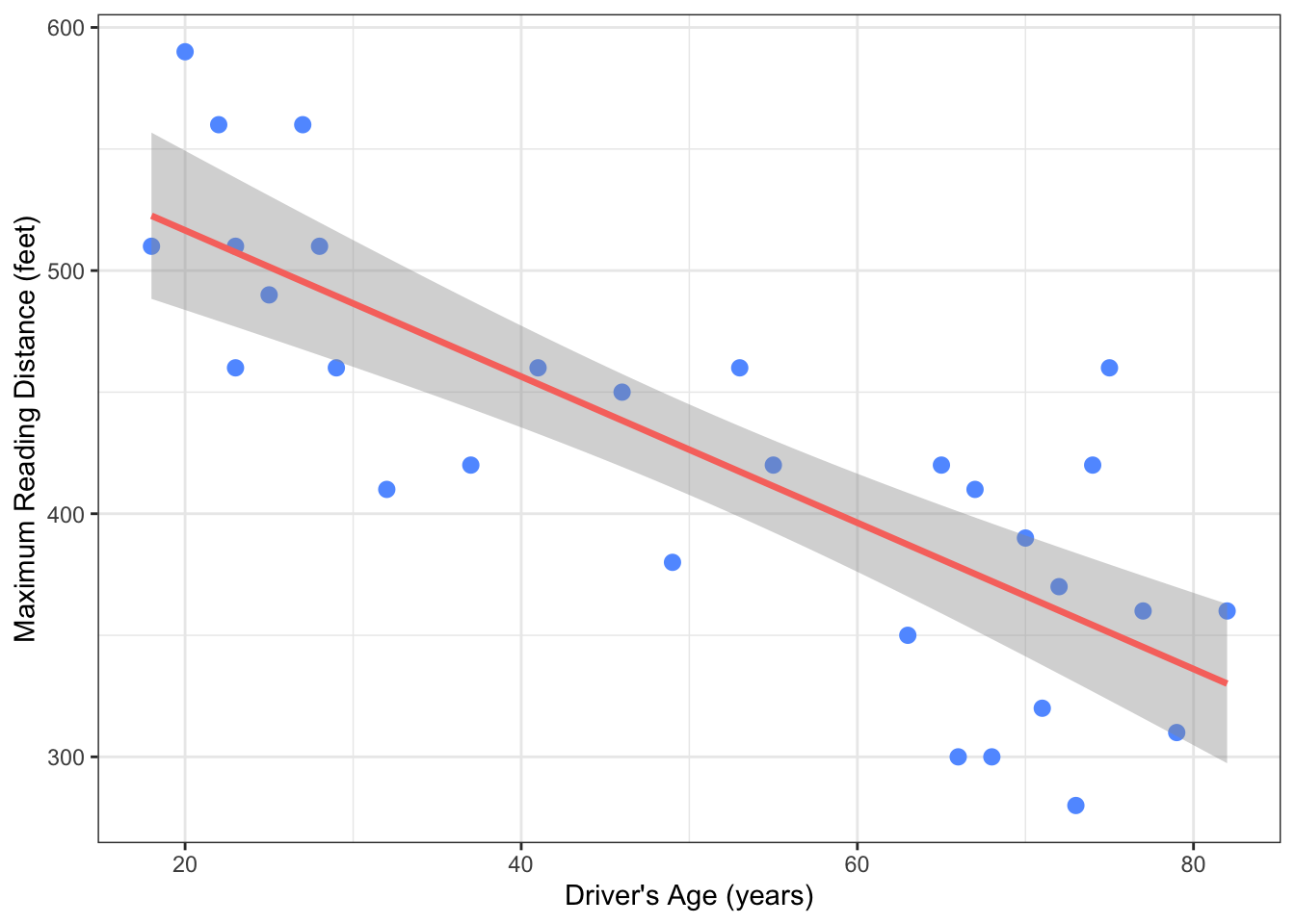
# Compute the correlation — single number between -1 and +1
cor(signdist$Age, signdist$Distance)                          # ← REPLACE: cor(your_x, your_y)
## [1] -0.8012447# Compute R² — proportion of variability explained
r <- cor(signdist$Age, signdist$Distance) # store r
r^2 # square it → R²## [1] 0.641993# Full hypothesis test — correlation + p-value + confidence interval
cor.test(signdist$Age, signdist$Distance) # ← REPLACE: cor.test(your_x, your_y)##
## Pearson's product-moment correlation
##
## data: signdist$Age and signdist$Distance
## t = -7.086, df = 28, p-value = 1.041e-07
## alternative hypothesis: true correlation is not equal to 0
## 95 percent confidence interval:
## -0.9013320 -0.6199255
## sample estimates:
## cor
## -0.8012447# Professional results table — modelsummary on an lm() fit
library(modelsummary) # for clean model tables
fit <- lm(Distance ~ Age, data = signdist) # ← REPLACE: y ~ x, data = your_df
modelsummary(fit, # same relationship, clean table
estimate = "{estimate} ({std.error})", # show estimate and SE
statistic = "p.value", # show p-values
title = "Linear Model: Age Predicting Sign Reading Distance") # ← REPLACE: your title| (1) | |
|---|---|
| (Intercept) | 576.682 (23.471) |
| (<0.001) | |
| Age | -3.007 (0.424) |
| (<0.001) | |
| Num.Obs. | 30 |
| R2 | 0.642 |
| R2 Adj. | 0.629 |
| AIC | 323.5 |
| BIC | 327.7 |
| Log.Lik. | -158.751 |
| F | 50.211 |
| RMSE | 48.07 |
Key interpretation: The highway sign study shows a strong negative correlation (\(r = -0.80\), \(p < 0.001\)). Driver age explains 64% of the variability in sign-reading distance (\(R^2 = 0.64\)). This is both statistically significant and practically meaningful.
8.2 Motivating Example
In Chapter 4, you learned to graph Q→Q relationships with scatter plots. In Chapter 5, you learned the framework of hypothesis testing for C→Q relationships. Now you combine both skills: you will test whether the pattern in a scatter plot — the linear relationship between two quantitative variables — is real or just a fluke of your sample.
Let’s start with a concrete example. Suppose a state transportation agency hires researchers to answer this question:
Does a driver’s age predict how far away they can read a highway sign?
This matters for public safety. If older drivers need signs to be larger or closer to read them, highway design should account for that. The researchers sample 30 drivers aged 18 to 82, and for each one, measure the maximum distance (in feet) at which they can read a newly designed sign. The data is in signdist.csv:
# Load the highway sign study — 30 drivers, Age and max reading Distance
# ← REPLACE: your file path
signdist <- read.csv("signdist.csv")

# Peek at the first six rows
head(signdist)
## Age Distance
## 1 18 510
## 2 20 590
## 3 22 560
## 4 23 510
## 5 23 460
## 6 25 490Each row is one driver. Age is the explanatory variable (x-axis) and Distance is the response (y-axis). Let’s see the relationship:
# Load ggplot2 — the graphics engine for this book
library(ggplot2)

# Q → Q: Scatter plot — each point is one driver
# ← REPLACE: x = your explanatory variable, y = your response variable
ggplot(data = signdist, aes(x = Age, y = Distance)) +
  geom_point(color = "#619CFF", size = 2.5) +       # blue points
  theme_bw() +                                        # clean black-and-white theme
  labs(x = "Driver's Age (years)",                    # ← REPLACE: your axis labels
       y = "Maximum Reading Distance (feet)",
       title = "Age vs. Sign Reading Distance\n(30 Drivers, Pennsylvania Study)")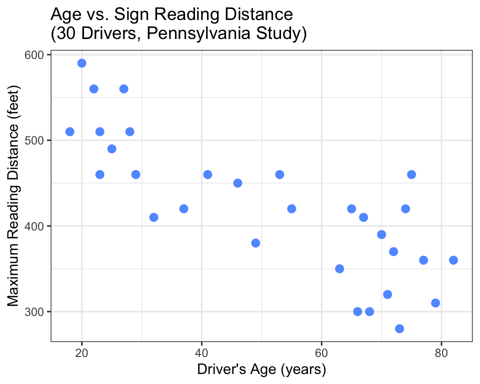
The pattern is clear: as age increases, reading distance decreases. The points trend downward. But here is the question that scatter plots cannot answer on their own:
Is this pattern real, or could random chance produce it?
With only 30 drivers, the downward trend could be real — or it could just be the luck of which 30 people were sampled. Maybe the true relationship in all drivers is flat, and this sample happened to include a few older drivers with poor eyesight. That is the central question statistical inference solves.
8.3 Theory
8.3.1 Interpreting a Scatter Plot: Direction, Form, Strength, Outliers
Before you compute a single number, you look at the graph. When examining a scatter plot, assess four things:
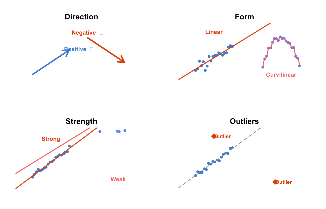
Figure 8.1: How to read a scatter plot: direction, form, strength, and outliers.
Direction — Does the cloud of points slope upward (positive: as x increases, y increases), downward (negative: as x increases, y decreases), or show no clear direction? Our sign study shows a negative direction: older age → shorter reading distance.
Form — Is the pattern roughly a straight line (linear), a curve (curvilinear), or something else like distinct clusters? Most of the tests in this book assume a linear form. If your data curves, you may need a transformation (Chapter 11). The sign study looks linear.
Strength — How tightly do the points cluster around the pattern? If they are tightly packed around the line, the relationship is strong. If they are widely scattered, it is weak. Our sign study appears moderately strong — the points follow the downward trend, but not perfectly.
Outliers — Are there points far from the main cloud? An outlier can pull the trend line toward itself or mask a real pattern. In the sign study, no points stand dramatically apart from the others.
What if your scatter plot does contain a single extreme outlier that drags the correlation toward itself? Is there a robust alternative — a “median-like” version of correlation that resists outliers? Yes. Spearman’s rank correlation (\(r_s\), sometimes called \(\rho\)) is Pearson’s \(r\) computed on the ranks of the data rather than the raw values. Because ranks are not pulled by extreme values (the largest value gets rank n whether it is 100 or 1,000,000), Spearman’s correlation resists outliers the way the median resists outliers for center. It also detects monotonic relationships — patterns that consistently increase or decrease, even if they curve — making it useful when Pearson’s linear assumption does not hold. In R, use cor(x, y, method = "spearman") or cor.test(x, y, method = "spearman"). Throughout this book, we use Pearson’s \(r\) as the default; Spearman’s is your backup when the scatter plot shows outliers or non-linear patterns.
These four judgments from the graph are invaluable. But they are subjective. What looks “moderately strong” to your eyes might look “weak” to someone else. This is why we need a number: the correlation coefficient.
8.3.2 The Correlation Coefficient — \(r\)
Definition: The correlation coefficient (also called Pearson’s \(r\) ) is a number between \(-1\) and \(+1\) that measures the strength and direction of a linear relationship between two quantitative variables.
Every word in that definition matters:
- Between \(-1\) and \(+1\) — These are the boundaries. \(-1\) is perfect negative correlation. \(+1\) is perfect positive correlation. \(0\) is no linear correlation.
- Strength and direction — A single number captures both. The sign (positive or negative) tells you direction. The absolute value (how far from 0) tells you strength.
- Linear — \(r\) only measures linear (straight-line) relationships. If the true relationship is a U-shaped curve, \(r\) might be near zero even though a strong relationship exists. This is why you always graph first.
How to interpret \(r\):
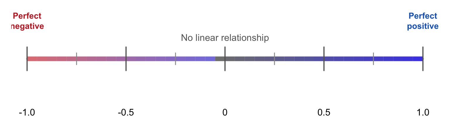
Figure 8.2: The correlation coefficient r ranges from -1 (perfect negative) to +1 (perfect positive). Zero means no linear relationship.
General guidelines (not rigid rules):
| \(r\) value | Strength |
|---|---|
| 0.0 to ±0.3 | Weak |
| ±0.3 to ±0.7 | Moderate |
| ±0.7 to ±1.0 | Strong |
But these are rough. A correlation of 0.29 and 0.31 are nearly identical in what they tell you — they do not flip from “weak” to “moderate” at exactly 0.30. Always report the exact \(r\) and let your reader judge.
Where does \(r\) come from? The formula is:
\[r = \frac{1}{n-1}\sum_{i=1}^n \left(\frac{x_i - \bar{x}}{s_x}\right)\left(\frac{y_i - \bar{y}}{s_y}\right)\]
You do not need to memorize or compute this by hand. R does it for you. But the formula reveals what \(r\) is actually measuring: it transforms each variable into z-scores (how many standard deviations above or below the mean), multiplies them together, and averages. If x and y tend to be on the same side of their means (both high or both low), the product is positive → positive \(r\). If they tend to be on opposite sides, the product is negative → negative \(r\).
8.3.3 \(R^2\) — Variance Explained
This is a concept many textbooks gloss over, but it is one of the most useful ideas in statistics. Once you have \(r\), square it:
\[R^2 = r^2\]
\(R^2\) (read “R-squared”) is the coefficient of determination. It answers the question:
What proportion of the variability in the response variable can be explained by the explanatory variable?
Think about what “explained” means. In the sign study, different drivers can read signs at different distances — there is variability in Distance. Some of that variability is associated with age (older drivers tend to read at shorter distances). The rest is due to other factors (eyesight quality, lighting conditions, measurement error). \(R^2\) tells you how much of the total variability is associated with the explanatory variable.
For example, if \(r = -0.8\), then \(R^2 = 0.64\). This means 64% of the variability in reading distance is associated with driver age. The other 36% comes from factors not in the model.
This is why \(R^2\) matters more than raw \(r\) for understanding practical importance. A correlation of \(r = 0.5\) sounds moderate, but \(R^2 = 0.25\) — meaning your explanatory variable explains only one quarter of the variability. That puts the finding in perspective.
A word of caution: since squaring removes the sign, \(R^2\) alone cannot tell you whether the relationship is positive or negative. A strong positive correlation (\(r = +0.8\)) and a strong negative correlation (\(r = -0.8\)) both produce \(R^2 = 0.64\). Always report both numbers: \(r\) tells direction, \(R^2\) tells practical magnitude. In your final paper or poster, include \(r\), \(R^2\), the p-value, and the confidence interval — together they tell the complete story.
In the next chapter (linear regression), \(R^2\) will become a central tool for evaluating models. For now, whenever you compute \(r\), also compute \(r^2\) and interpret it.
8.3.4 Hypothesis Test for Correlation
You have seen the 4-step process in Chapter 5. It applies to correlation too:
State the hypotheses.
- \(H_0\): \(\rho = 0\) (the population correlation is zero — no linear relationship)
- \(H_a\): \(\rho \neq 0\) (there is a linear relationship in the population)
Notice we use the Greek letter \(\rho\) (rho) for the population correlation, and \(r\) for the sample correlation. The hypothesis is about the population, not your particular sample.
This is a deliberate convention across all of statistics: Greek letters refer to population parameters (unknown true values), while Roman letters refer to sample statistics (values computed from your data). You have already seen this pattern: \(\mu\) (mu) for population mean vs. \(\bar{x}\) for sample mean, \(\sigma\) (sigma) for population standard deviation vs. \(s\) for sample SD. Now you know: \(\rho\) (rho) for population correlation vs. \(r\) for sample correlation. Once you understand this convention, you can decode statistical notation across any chapter — Greek = population truth, Roman = sample estimate.
Choose the sample and test. Q→Q with a linear form → Pearson’s correlation test:
cor.test().Assess the evidence. Get the p-value from
cor.test(). Is p < 0.05?Draw a conclusion. Reject \(H_0\) if p < 0.05, or fail to reject if p ≥ 0.05. Report \(r\), \(R^2\), and your interpretation.
Important: The correlation test only makes sense if the relationship appears linear. If the scatter plot curves, a correlation test can give a misleading p-value. Always graph first.
8.3.4.1 Frame Your Hypothesis
Before we write the code, let’s make this concrete for your own research project. Take two minutes to write down the hypotheses for a Q→Q relationship.
Exercise 8.1
Your Turn: Frame Your Hypothesis
Think about your own research question — the one you chose at the beginning of this book. If you have not settled on one yet, here are some examples to work with:
- Is a country’s GDP associated with its life expectancy?
- Are hours of screen time associated with hours of sleep among high school students?
- Is a student’s math score associated with their physics score?
Now answer these four questions for your project:
- What are your two quantitative variables? Name them. Which is explanatory (x-axis) and which is response (y-axis)?
- What is your research question? Write it as a question.
- What is your null hypothesis (\(H_0\))? Write it in words: “There is no linear relationship between…”
- What is your alternative hypothesis (\(H_a\))? Write it in words: “There is a linear relationship between…”
Keep these hypotheses somewhere you can see them. You will test them in code very shortly.
8.4 Code
8.4.1 Step 1: State the Hypotheses
For the highway sign study:
- \(H_0\): \(\rho = 0\) — in the population of all drivers, there is no linear relationship between age and maximum sign-reading distance.
- \(H_a\): \(\rho \neq 0\) — in the population, there is a linear relationship between age and sign-reading distance.
8.4.2 Step 2: Load the Data and Graph
# Load the packages you need for this chapter
library(ggplot2)       # for all graphing
library(dplyr)         # for data manipulation with %>%
library(modelsummary)  # for professional summary tables

# Load the highway sign study — ← REPLACE: your file path
signdist <- read.csv("signdist.csv")
# Always graph first — the scatter plot with trend line
# ← REPLACE: x = your explanatory variable, y = your response variable
ggplot(data = signdist, aes(x = Age, y = Distance)) +
geom_point(color = "#619CFF", size = 2.5) + # each point = one driver
stat_smooth(method = "lm", se = TRUE, # lm = linear model fit
color = "#F8766D", fill = "#F8766D", # red line with shaded CI band
alpha = 0.2, linewidth = 1.2) + # CI band transparency
theme_bw() + # clean black-and-white theme
labs(x = "Driver's Age (years)", # ← REPLACE: your axis labels
y = "Maximum Reading Distance (feet)",
title = "Age vs. Sign Reading Distance")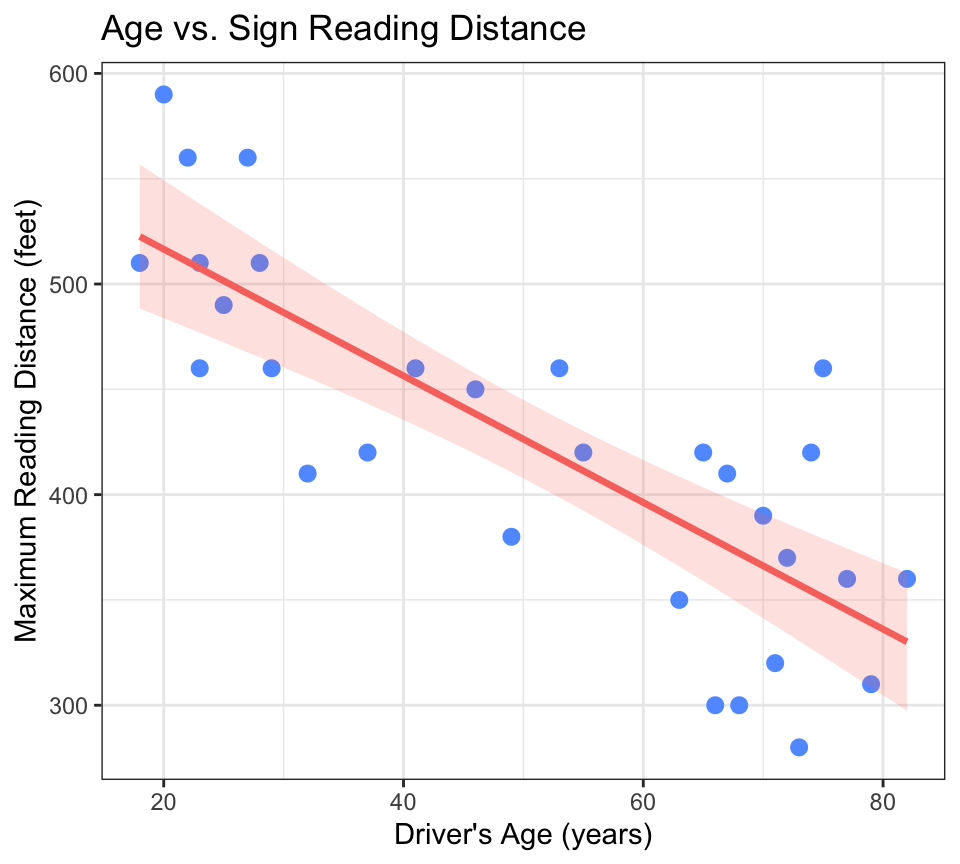
stat_smooth(method = "lm")fits a linear model — the straight line that best fits the data (you will learn the math behind this in Chapter 9)se = TRUEadds a gray shaded band showing the confidence interval for the trend line — the range within which the true line likely falls- The red line slopes downward — visual confirmation of a negative relationship
- The points are moderately scattered around the line — the relationship is not perfect, but it is visible
8.4.3 Step 3: Estimate the Evidence — cor() and cor.test()
The simplest way to get the correlation is cor():
# Basic correlation — a single number between -1 and +1
# ← REPLACE: your x variable, your y variable
cor(signdist$Age, signdist$Distance)
## [1] -0.8012447# Compute R² — square r to get variance explained
r <- cor(signdist$Age, signdist$Distance) # store r
r^2 # compute R²## [1] 0.641993The correlation is about -0.80 — a strong negative relationship. Squaring it gives \(R^2 \approx 0.64\): approximately 64% of the variability in sign-reading distance is associated with driver age.
But cor() only gives you the number — no p-value, no confidence interval, no formal test. For the full hypothesis test, use cor.test():
# Full hypothesis test — correlation + p-value + confidence interval
# ← REPLACE: your x variable, your y variable
cor.test(signdist$Age, signdist$Distance)
##
## Pearson's product-moment correlation
##
## data: signdist$Age and signdist$Distance
## t = -7.086, df = 28, p-value = 1.041e-07
## alternative hypothesis: true correlation is not equal to 0
## 95 percent confidence interval:
## -0.9013320 -0.6199255
## sample estimates:
## cor
## -0.8012447Let’s walk through the output:
t = -7.0865 — The test statistic. Like the t-statistic from Chapter 5, this measures how many standard errors the observed \(r\) is from zero. A large absolute t-value means strong evidence against \(H_0\). Here, \(|t| \approx 7.1\) is large.
Why does a correlation test produce a t-statistic? Under the hood, testing whether a population correlation is zero is mathematically equivalent to a t-test. The conversion formula is \(t = r \sqrt{\frac{n-2}{1-r^2}}\), and this t follows a t-distribution with \(n-2\) degrees of freedom. In fact, testing whether \(r\) differs from zero gives the exact same p-value as testing whether the slope of the regression line is zero (Chapter 9). The t-statistic is not just for comparing group means — it is a general-purpose measure of “how many standard errors is the estimate from the null value?” that appears across many different statistical tests.
df = 28 — Degrees of freedom. For correlation, df = n - 2 = 30 - 2 = 28.
p-value = 1.041e-07 — This is scientific notation for 0.0000001041, which is far below 0.05. If there were truly no linear relationship in the population (\(\rho = 0\)), the probability of getting a sample correlation at least this extreme is about 1 in 10 million. That is overwhelming evidence against \(H_0\).
95 percent confidence interval: -0.9131834 -0.5819248 — We are 95% confident that the true population correlation \(\rho\) lies between about -0.91 and -0.58. Notice the interval does not contain 0 — consistent with the tiny p-value.
sample estimates: cor = -0.8012447 — The observed sample correlation \(r\).
8.4.3.1 Professional Table with modelsummary()
The cor.test() output is a wall of text. For a report, you want a clean table. Since correlation and regression are two sides of the same coin, you can fit a simple linear model with lm() and display it with modelsummary() — the same function you will use for regression tables in Chapters 9–11:
# modelsummary() + lm() — clean, report-ready results table
# ← REPLACE: y ~ x, data = your_data_frame
library(modelsummary)

# Fit a simple linear model — Distance predicted by Age
# This is the same relationship cor.test() just tested
fit <- lm(Distance ~ Age, data = signdist)              # ← REPLACE: your_y ~ your_x

# Display as a professional table — one row per coefficient
modelsummary(fit,
  estimate  = "{estimate} ({std.error}){stars}",        # coefficient (SE) + significance stars
  statistic = NULL,                                      # hide redundant t-stat column
  gof_map   = c("r.squared", "nobs"),                   # show R² and sample size
title = "Linear Model: Age Predicting Sign Reading Distance") # ← REPLACE: your title| (1) | |
|---|---|
| (Intercept) | 576.682 (23.471)*** |
| Age | -3.007 (0.424)*** |
| R2 | 0.642 |
| Num.Obs. | 30 |
The output shows the coefficients with standard errors and significance stars, plus \(R^2\) and sample size at the bottom. The estimate column tells you: the intercept (Distance when Age = 0) and the slope (how much Distance changes per year of Age). The negative slope confirms the negative correlation.
You will learn to interpret these coefficients in detail in Chapter 9. For now, the key takeaway: modelsummary(lm()) presents the same correlation relationship in a publication-ready format — and it sets you up for the regression chapters ahead.
Why do we need lm() here instead of just feeding cor.test() into modelsummary()? Because modelsummary() is designed for model objects — the output of functions like lm(), aov(), and glm() that fit a full model. It does not accept raw test output like cor.test(). The lm() fit and the cor.test() describe the exact same Q→Q relationship; lm() just packages it in the format modelsummary() expects. Think of it as a preview of Chapter 9 — every number in that table will make complete sense once you learn regression.
8.4.4 Step 4: Draw a Conclusion
The p-value is 1.04 × 10⁻⁷, far below 0.05. We reject \(H_0\) and conclude there is strong evidence of a linear relationship between driver age and sign-reading distance in the population. The correlation is \(r = -0.80\), \(R^2 = 0.64\), meaning 64% of the variability in reading distance is associated with driver age. The relationship is negative and strong: on average, older drivers can read signs from shorter distances.
8.4.5 A Second Example: Weak Correlation in the NESARC Data
Not all Q → Q relationships are strong. Let’s return to our NESARC data and ask:
Among young adult daily smokers, is age associated with how many cigarettes they smoke per day?
# Load the NESARC survey — ← REPLACE: your file path
NESARC <- read.csv("NESARC.csv")

# Build the nesarc subset — the same data frame from Chapters 3–5
# ← REPLACE: adapt filter, rename, factor labels to YOUR dataset
nesarc <- NESARC %>%
  filter(
    S3AQ1A == 1,         # smoked 100+ cigarettes in lifetime
    S3AQ3B1 == 1,        # smoked in the past 12 months
    CHECK321 == 1,       # valid nicotine dependence data
    AGE <= 25             # young adults only
  ) %>%
  rename(
    Ethnicity          = ETHRACE2A,
    Age                = AGE,
    MajorDepression    = MAJORDEPLIFE,
    TobaccoDependence  = TAB12MDX,
    DailyCigsSmoked    = S3AQ3C1,
    Sex                = SEX
  ) %>%
  select(Ethnicity, Age, MajorDepression, TobaccoDependence, DailyCigsSmoked, Sex)

# Code 99 as missing — 99 means "Unknown" in the NESARC code book
nesarc$DailyCigsSmoked[nesarc$DailyCigsSmoked == 99] <- NA    # ← REPLACE: your NA codes

# Convert numeric codes into readable labels
nesarc$MajorDepression <- factor(nesarc$MajorDepression,
  labels = c("No Depression", "Yes Depression"))
nesarc$TobaccoDependence <- factor(nesarc$TobaccoDependence,
  labels = c("No Dependence", "Nicotine Dependence"))
nesarc$Sex <- factor(nesarc$Sex, labels = c("Female", "Male"))
# Scatter plot — Age vs Daily Cigarettes
# ← REPLACE: x = your explanatory variable, y = your response
ggplot(data = nesarc, aes(x = Age, y = DailyCigsSmoked)) +
geom_point(alpha = 0.4, color = "#619CFF") + # semi-transparent points
stat_smooth(method = "lm", se = TRUE, # linear trend line
color = "#F8766D", fill = "#F8766D",
alpha = 0.2, linewidth = 1.2) +
theme_bw() +
labs(x = "Age (years)", y = "Daily Cigarettes Smoked",
title = "Age vs. Daily Cigarette Consumption\n(Young Adult Daily Smokers, NESARC)")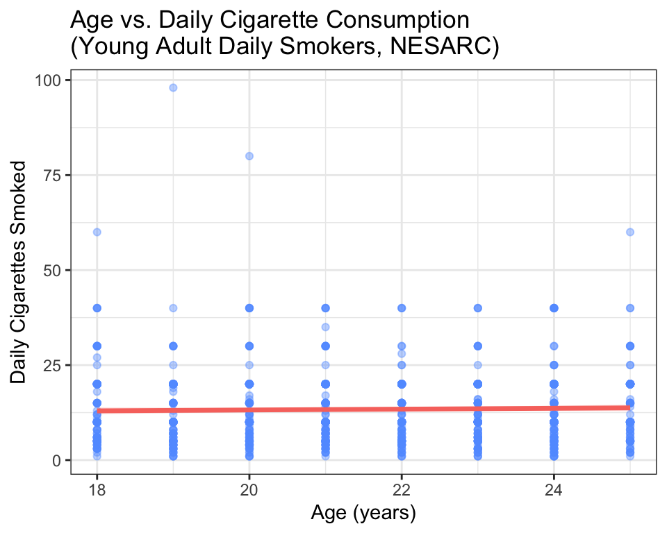
The trend line is nearly flat. The points are widely scattered. Compare this to the sign study: the pattern here is far weaker. Let’s get the numbers:
# Correlation test — Age vs Daily Cigarettes in the NESARC subset
# ← REPLACE: your x variable, your y variable
cor.test(nesarc$Age, nesarc$DailyCigsSmoked)
##
## Pearson's product-moment correlation
##
## data: nesarc$Age and nesarc$DailyCigsSmoked
## t = 1.0195, df = 1313, p-value = 0.3081
## alternative hypothesis: true correlation is not equal to 0
## 95 percent confidence interval:
## -0.02597181 0.08205833
## sample estimates:
## cor
## 0.02812538# Compute R² — what proportion of variability is explained?
r <- cor(nesarc$Age, nesarc$DailyCigsSmoked, use = "complete.obs")
r^2## [1] 0.0007910372The correlation is about 0.08 — near zero. \(R^2\) is about 0.006 — less than 1% of the variability in daily cigarette consumption is associated with age. The p-value is above 0.05, so we fail to reject \(H_0\). There is not enough evidence to conclude a linear relationship exists.
This is a valuable lesson: the correlation test does not always return a significant result, and that is informative. It tells you that, among young adult daily smokers, age alone does not predict how much someone smokes. You would need to look at other variables — perhaps depression status, nicotine dependence, or sex — to explain cigarette consumption.
8.4.6 Professional Correlation Matrix with modelsummary
When you have multiple quantitative variables, computing pairwise correlations one at a time is tedious. datasummary_correlation() computes them all at once and presents them in a clean table:
# Professional correlation matrix — all Q→Q pairs at once
# ← REPLACE: select your quantitative variables
library(modelsummary)

# Select just the quantitative variables from nesarc
nesarc_quant <- nesarc[, c("Age", "DailyCigsSmoked")]   # ← REPLACE: your Q variables

# Correlation matrix — shows r for every pair
datasummary_correlation(nesarc_quant,
title = "Correlation Matrix: NESARC Young Adult Smokers") # ← REPLACE: your title| Age | DailyCigsSmoked | |
|---|---|---|
| Age | 1 | . |
| DailyCigsSmoked | .03 | 1 |
For the highway sign study, there are only two quantitative variables, but if you had more (like Age, DailyCigsSmoked, and a third variable), datasummary_correlation() would show every pair in a single table.
This is your upgrade: compute correlations with cor() and cor.test() to understand what they mean, then use datasummary_correlation() to present them professionally.
8.5 Interpretation
8.5.1 How to Read cor.test() Output — A Quick Reference
| What to Find | Where It Is | What It Tells You |
|---|---|---|
| \(r\) | cor at the bottom |
The sample correlation. Sign = direction, magnitude = strength. |
| p-value | p-value = ... |
Probability of data this extreme if \(\rho = 0\). The star of the show. |
| 95% CI | 95 percent confidence interval: |
The plausible range for the true population correlation \(\rho\). |
| \(R^2\) | Square \(r\) yourself | Proportion of variability in the response explained by the explanatory variable. |
Golden rule: the p-value tells you whether there is a linear relationship. \(r\) tells you direction and strength. \(R^2\) tells you practical importance.
8.5.2 Writing Up Your Results
When you report a correlation for your project, include all the essential information:
A Pearson correlation test found a strong, significant negative relationship between driver age and maximum sign-reading distance, \(r(28) = -0.80\), \(p < 0.001\), 95% CI \([-0.91, -0.58]\). Age accounted for 64% of the variability in reading distance (\(R^2 = 0.64\)).
For the weak NESARC example:
A Pearson correlation test found no significant linear relationship between age and daily cigarette consumption among young adult daily smokers, \(r(1313) = 0.08\), \(p = 0.35\), 95% CI \([-0.03, 0.13]\). Age accounted for less than 1% of the variability in cigarette consumption (\(R^2 = 0.006\)).
Notice the format: test name, \(r\), degrees of freedom (n - 2) in parentheses, p-value, confidence interval, and \(R^2\) with interpretation. This is the standard for any report or poster.
8.5.3 Common Mistakes Students Make
Computing \(r\) on non-linear data. If the scatter plot is U-shaped, \(r\) might be near zero even though a strong relationship exists. Always check the scatter plot before running
cor.test().Assuming correlation = causation. A strong \(r\) means two variables move together — it does NOT mean one causes the other. Ice cream sales and drowning deaths are correlated (both increase in summer), but eating ice cream does not cause drowning. The third variable (hot weather) drives both. Causation requires a designed experiment (Appendix D).
Ignoring \(R^2\). A correlation of \(r = 0.3\) is statistically significant with a large enough sample, but \(R^2 = 0.09\) — your explanatory variable explains only 9% of the variability. Always report \(R^2\) so your reader can judge practical importance.
Treating 0.3 / 0.7 as magic cutoffs. The difference between \(r = 0.69\) and \(r = 0.71\) is negligible. These thresholds are rough guidelines, not rules. Report the exact value.
Running
cor.test()withoutuse = "complete.obs"incor(). If your data has missing values (NA),cor()returnsNAunless you tell it how to handle them.cor.test()handles NAs automatically, butcor()requiresuse = "complete.obs"— as shown in the NESARC example above. What does"complete.obs"stand for? It is short for “complete observations.” It tellscor()to use only the rows where both x and y have non-missing values. Rows with an NA in either variable are temporarily skipped for this one calculation — the original dataset is not changed, and no rows are permanently deleted. They are simply excluded from this specific correlation.Forgetting degrees of freedom in the write-up. The df for correlation is \(n - 2\). Always include it: \(r(28) = -0.80\), not just \(r = -0.80\).
Confusing \(r\) with the slope. The correlation \(r\) is a unitless number between -1 and +1. The slope (Chapter 9) has units (e.g., feet per year). A steep slope can have a weak \(r\) if the points are scattered, and a shallow slope can have a strong \(r\) if the points are tightly packed. They measure different things.
8.5.4 What Comes Next
Correlation tells you whether two variables move together and how strongly. But it does not let you predict: “If a driver is 50 years old, what is their expected reading distance?” For that, you need a model — an equation that maps one variable to another.
In Chapter 9 (Linear Regression), you will learn to fit a straight line through your data, interpret its slope and intercept, and use it to make predictions. Correlation and regression are two sides of the same coin: \(r\) measures the strength of the linear relationship, and regression gives you the line itself.