Chapter 9 Linear Regression
9.1 TL;DR: Linear Regression
- Regression models the relationship between a quantitative response (\(Y\)) and one or more explanatory variables (\(X\)) by fitting a line through the data points.
- The least-squares regression line is the unique line that minimizes the sum of squared vertical deviations from the data points to the line.
- The line has the form \(\widehat{Y} = a + bX\), where \(b\) is the slope (the average change in \(Y\) for a 1-unit increase in \(X\)) and \(a\) is the intercept (the predicted value of \(Y\) when \(X = 0\)).
- Use
lm(Y ~ X, data = df)in R to fit a linear model.summary(model)gives you the coefficients, their p-values, and \(R^2\) — the proportion of variance in \(Y\) explained by \(X\). predict(model, newdata = data.frame(X = value))estimates \(Y\) for a given \(X\). Always check whether the new \(X\) is within the range of your original data — predicting outside that range is extrapolation and can be wildly wrong.
# Load the packages you need
library(ggplot2)      # for plotting
library(dplyr)        # for filter(), rename(), select(), %>%
library(modelsummary) # for professional tables

# Load the NESARC survey (43,093 adults) — ← REPLACE: your file path
NESARC <- read.csv("NESARC.csv")

# Build the nesarc subset — young adult daily smokers with valid data
# ← REPLACE: adapt filter, rename to YOUR dataset
nesarc <- NESARC %>%
  filter(
    S3AQ1A == 1,         # smoked 100+ cigarettes in lifetime
    S3AQ3B1 == 1,        # smoked in the past 12 months
    CHECK321 == 1,       # valid nicotine dependence data
    AGE <= 25             # young adults only
  ) %>%
  rename(
    Age                = AGE,           # age in years
    DailyCigsSmoked    = S3AQ3C1,       # cigarettes per day (99 = missing)
    MajorDepression    = MAJORDEPLIFE,  # lifetime depression diagnosis
    TobaccoDependence  = TAB12MDX,      # tobacco dependence, past 12 months
    Sex                = SEX,           # sex (1=Female, 2=Male)
    Ethnicity          = ETHRACE2A      # ethnicity (1–5)
  ) %>%
  select(Age, DailyCigsSmoked, MajorDepression, TobaccoDependence, Sex, Ethnicity)

# Code 99 as missing — 99 means "Unknown" in the NESARC code book
nesarc$DailyCigsSmoked[nesarc$DailyCigsSmoked == 99] <- NA    # ← REPLACE: your NA codes

# Fit a linear model: predict cigarettes per day from age
# ← REPLACE: Y_variable ~ X_variable
model <- lm(DailyCigsSmoked ~ Age, data = nesarc)   # lm() fits the least-squares line

# Summary of the model — coefficients, R², p-values
summary(model)
##
## Call:
## lm(formula = DailyCigsSmoked ~ Age, data = nesarc)
##
## Residuals:
## Min 1Q Median 3Q Max
## -12.742 -6.075 -3.075 6.481 84.925
##
## Coefficients:
## Estimate Std. Error t value Pr(>|t|)
## (Intercept) 10.9641 2.3662 4.634 3.95e-06 ***
## Age 0.1111 0.1090 1.020 0.308
## ---
## Signif. codes: 0 '***' 0.001 '**' 0.01 '*' 0.05 '.' 0.1 ' ' 1
##
## Residual standard error: 8.657 on 1313 degrees of freedom
## (5 observations deleted due to missingness)
## Multiple R-squared: 0.000791, Adjusted R-squared: 3.003e-05
## F-statistic: 1.039 on 1 and 1313 DF, p-value: 0.3081# Predict cigarettes per day for a 22-year-old — ← REPLACE: X = value
predict(model, newdata = data.frame(Age = 22)) # estimated Y at X = 22## 1
## 13.40836# Scatterplot with regression line — ← REPLACE: x = your_X, y = your_Y
ggplot(nesarc, aes(x = Age, y = DailyCigsSmoked)) +
geom_point(alpha = 0.1) + # semi-transparent points (lots of them)
geom_smooth(method = "lm", se = TRUE) + # add the regression line + confidence band
theme_bw() + # clean black-and-white theme
labs(x = "Age (years)", # ← REPLACE: your x-axis label
y = "Cigarettes per Day", # ← REPLACE: your y-axis label
title = "Daily Cigarette Consumption vs. Age") # ← REPLACE: your title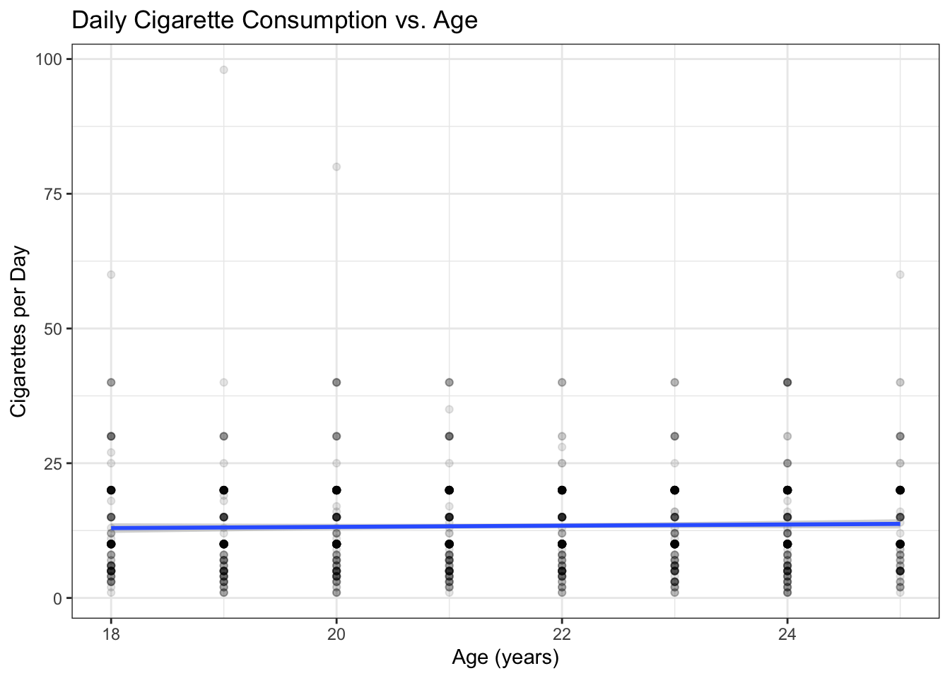
# Professional regression results table
library(modelsummary)
modelsummary(model, # display the model in a clean table
estimate = "{estimate} ({std.error})", # coefficient (standard error)
statistic = "p = {p.value}", # p-value for each coefficient
title = "Linear Regression Results") # ← REPLACE: your title| (1) | |
|---|---|
| (Intercept) | 10.964 (2.366) |
| p = <0.001 | |
| Age | 0.111 (0.109) |
| p = 0.308 | |
| Num.Obs. | 1315 |
| R2 | 0.001 |
| R2 Adj. | 0.000 |
| AIC | 9412.3 |
| BIC | 9427.8 |
| Log.Lik. | -4703.142 |
| F | 1.039 |
| RMSE | 8.65 |
Key interpretation: The slope of 0.111 means each additional year of age predicts about 0.1 more cigarettes per day, on average. The p-value tells you whether age is a significant predictor — if p < 0.05, age meaningfully predicts smoking quantity. \(R^2\) tells you what fraction of the variability in cigarette consumption is explained by age alone.
9.2 Motivating Example
In Chapter 4, you learned to use a scatterplot to explore the relationship between two quantitative variables. In Chapter 8, you learned to measure the strength and direction of a linear relationship with the correlation coefficient \(r\). But knowing that \(r = 0.30\) or \(r = -0.65\) does not fully answer the practical questions you face in a research project.
Consider this scenario: a highway safety agency needs to determine how far away drivers of different ages can read a road sign. They survey 30 drivers, measuring each one’s age and the maximum distance (in feet) at which a standard highway sign is still legible. Here is the data:
# Load the sign distance dataset — 30 drivers, age and reading distance
# ← REPLACE: your file path
signdist <- read.csv("signdist.csv")
head(signdist) # first 6 rows## Age Distance
## 1 18 510
## 2 20 590
## 3 22 560
## 4 23 510
## 5 23 460
## 6 25 490# Visualize the relationship — does distance change with age?
library(ggplot2)
ggplot(signdist, aes(x = Age, y = Distance)) +
geom_point(color = "steelblue", size = 2) + # each dot = one driver
theme_bw() + # clean theme
labs(x = "Driver Age (years)", # ← REPLACE: your x-axis label
y = "Sign Legibility Distance (feet)", # ← REPLACE: your y-axis label
title = "Sign Reading Distance vs. Driver Age")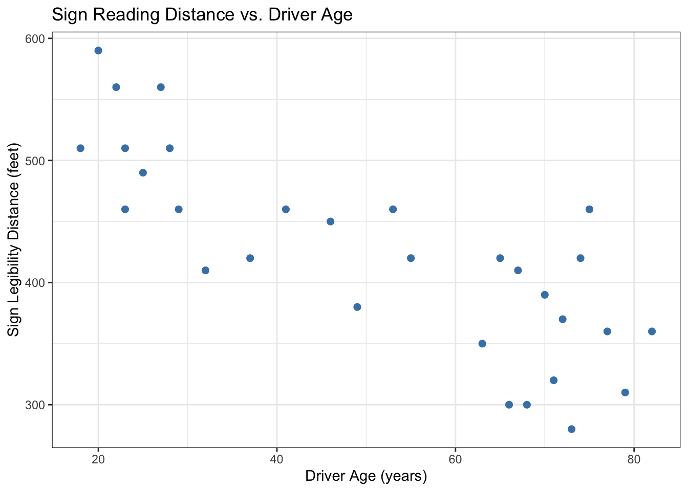
Figure 9.1: Maximum sign reading distance decreases with driver age. Each point is one driver.
# Calculate the correlation — how strong is the linear relationship?
# ← REPLACE: your x variable, your y variable
cor(signdist$Age, signdist$Distance) # r ≈ -0.80 — strong negative relationship## [1] -0.8012447The plot shows a clear downward trend: older drivers need to be closer to read the sign. The correlation is \(r \approx -0.80\) — a strong negative relationship. But the safety agency has a more specific question: “At what distance would the average 60-year-old driver be able to read this sign?”
You cannot answer that with the correlation coefficient alone. \(r = -0.80\) tells you the relationship is strong and negative — it does not tell you the predicted distance for a 60-year-old. To make that prediction, you need to summarize the relationship with a line and then use that line to estimate the response for a given value of the explanatory variable.
That is exactly what linear regression does. You fit a straight line through the data points — the line that best captures the pattern — and then use the equation of that line to make predictions, quantify relationships, and test whether the explanatory variable truly matters.
# Fit a linear model: predict Distance from Age
# ← REPLACE: Y ~ X, data = your_data
model_sign <- lm(Distance ~ Age, data = signdist) # lm() fits the least-squares line
summary(model_sign) # show the full model output##
## Call:
## lm(formula = Distance ~ Age, data = signdist)
##
## Residuals:
## Min 1Q Median 3Q Max
## -78.231 -41.710 7.646 33.552 108.831
##
## Coefficients:
## Estimate Std. Error t value Pr(>|t|)
## (Intercept) 576.6819 23.4709 24.570 < 2e-16 ***
## Age -3.0068 0.4243 -7.086 1.04e-07 ***
## ---
## Signif. codes: 0 '***' 0.001 '**' 0.01 '*' 0.05 '.' 0.1 ' ' 1
##
## Residual standard error: 49.76 on 28 degrees of freedom
## Multiple R-squared: 0.642, Adjusted R-squared: 0.6292
## F-statistic: 50.21 on 1 and 28 DF, p-value: 1.041e-07# Predict the reading distance for a 60-year-old driver
# ← REPLACE: X = value
predict(model_sign, newdata = data.frame(Age = 60)) # ~397 feet — the agency's answer## 1
## 396.2718The model estimates that a 60-year-old driver can read the sign from about 397 feet away. The equation of the fitted line — which you will learn to derive and interpret in the next sections — provides a compact, quantitative description of how distance changes with age. In the remaining sections, we build this up from first principles, then apply it to the NESARC data to answer a health research question.
9.3 Theory
9.3.0.1 What Is a Regression Line?
A regression line is a straight line that summarizes the relationship between two quantitative variables. In the simplest case — simple linear regression — we have one explanatory variable (\(X\)) and one response variable (\(Y\)). The line is described by the equation:
\[\widehat{Y} = a + bX\]
where:
- \(\widehat{Y}\) (pronounced “Y-hat”) is the predicted value of the response variable. The hat reminds you it is an estimate, not the actual observed value.
- \(a\) is the intercept — the predicted value of \(Y\) when \(X = 0\). Graphically, it is where the line crosses the vertical axis.
- \(b\) is the slope — the average change in \(Y\) for every 1-unit increase in \(X\). Graphically, it is how steep the line is. A positive slope means \(Y\) increases as \(X\) increases. A negative slope means \(Y\) decreases as \(X\) increases.
For the sign-reading example, the fitted line is:
\[\widehat{\text{Distance}} = 576.7 - 3.0 \times \text{Age}\]
The slope of \(-3.0\) means: for each additional year of age, the maximum reading distance decreases by about 3 feet, on average. The intercept of 576.7 is the predicted distance for a driver aged 0 — which has no practical meaning (you cannot test newborns), but the intercept is necessary to position the line correctly.
9.3.0.2 The Least-Squares Criterion
There are infinitely many lines you could draw through a cloud of data points. Which one is the “best”? We need a criterion — a rule for deciding.
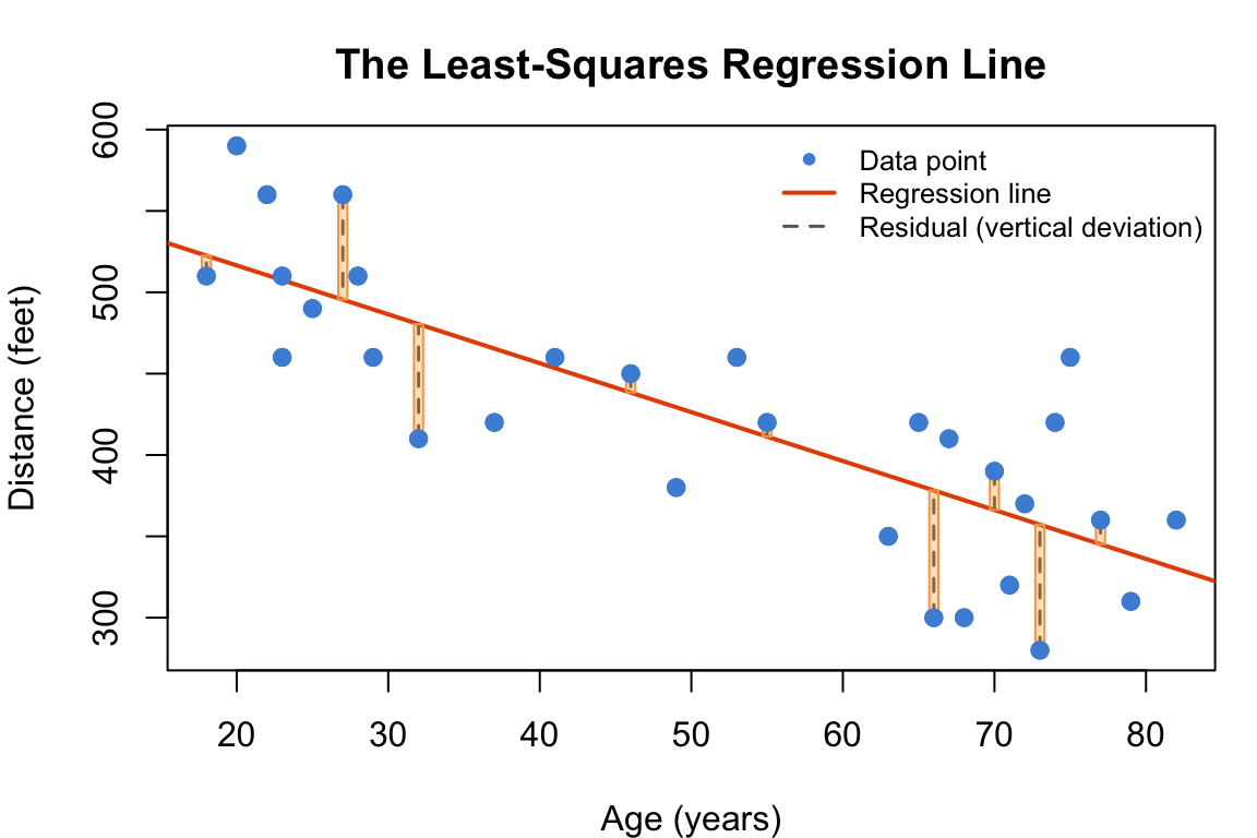
Figure 9.2: The least-squares criterion: minimize the sum of squared vertical deviations (yellow squares) between each data point and the line.
The most widely used criterion is called least squares. Here is the idea:
For each data point, measure the vertical distance between the point’s actual \(Y\) value and the line’s predicted \(\widehat{Y}\) value at that same \(X\). This distance is called the residual: \(e = Y - \widehat{Y}\).
Square each residual (this makes negative and positive deviations both count positively, and gives more weight to points far from the line).
Sum up all the squared residuals. This sum is often called SSE (Sum of Squared Errors) or RSS (Residual Sum of Squares).
The least-squares regression line is the one unique line that makes this sum as small as possible. Among all possible lines, it has the smallest total squared error.
Geometrically, the yellow squares in the diagram above represent the squared residuals. The least-squares line is the one that makes the total yellow area as small as possible.
This is the same “square rather than absolute value” logic you saw with standard deviation in Chapter 2. Squaring gives extra weight to points far from the line — a single large deviation affects the line’s position more than several small ones — which is usually desirable because you want the line to be pulled toward the general cloud but not dominated by a few stragglers. More importantly, squaring guarantees a unique mathematical solution: the least-squares line is the only line with a simple closed-form formula (the one you saw on the previous page). Using absolute deviations — called “least absolute deviations” regression — does not guarantee a single best solution; multiple lines might tie for best. Least squares won out historically because it is computationally elegant and mathematically tractable, not because squaring is philosophically superior to absolute values.
9.3.0.3 Where Do the Intercept and Slope Come From?
Given the five quantities below — all of which you can compute from your data — the least-squares slope and intercept have closed-form formulas:
- \(\bar{X}\) — the mean of the explanatory variable
- \(s_X\) — the standard deviation of the explanatory variable
- \(\bar{Y}\) — the mean of the response variable
- \(s_Y\) — the standard deviation of the response variable
- \(r\) — the correlation coefficient between \(X\) and \(Y\)
The formulas are:
\[b = r \cdot \frac{s_Y}{s_X}\]
\[a = \bar{Y} - b \cdot \bar{X}\]
Let us verify this for the sign-reading data:
# Calculate the five quantities needed for the least-squares line
x_bar <- mean(signdist$Age) # mean age — ← REPLACE: your X variable
s_x <- sd(signdist$Age) # SD of age
y_bar <- mean(signdist$Distance) # mean distance — ← REPLACE: your Y variable
s_y <- sd(signdist$Distance) # SD of distance
r_val <- cor(signdist$Age, signdist$Distance) # correlation — ← REPLACE: your X, Y
# Compute slope and intercept by hand
b_hand <- r_val * (s_y / s_x) # slope formula: r * (s_Y / s_X)
a_hand <- y_bar - b_hand * x_bar # intercept formula: Y-bar - b * X-bar
# Display the hand-calculated values
c(intercept = a_hand, slope = b_hand)## intercept slope
## 576.681937 -3.006835# Compare with lm() — the numbers should match
coef(lm(Distance ~ Age, data = signdist)) # same intercept and slope## (Intercept) Age
## 576.681937 -3.006835Notice that the hand-calculated slope and intercept match exactly what lm() produces. You will almost never compute these by hand in practice — lm() does it instantly — but seeing the formulas demystifies what is happening inside the function. The slope \(b\) is simply the correlation \(r\), scaled by the ratio of the standard deviations. If \(r = 0\), the slope is zero and the line is flat — \(X\) does not predict \(Y\) at all.
9.3.0.4 Interpreting the Slope
The slope is the most important number in a regression output because it tells you the direction and magnitude of the relationship:
| Slope Sign | Meaning |
|---|---|
| \(b > 0\) (positive) | As \(X\) increases, \(Y\) tends to increase. The line slopes upward. |
| \(b < 0\) (negative) | As \(X\) increases, \(Y\) tends to decrease. The line slopes downward. |
| \(b = 0\) | No linear relationship — the line is flat. Knowing \(X\) does not help predict \(Y\). |
In plain language, the slope tells you: “For every 1-unit increase in \(X\), \(Y\) changes by \(b\) units, on average.” The phrase “on average” is essential — the regression line describes the general trend, not a deterministic rule. Individual data points scatter above and below the line.
9.3.0.5 The Intercept: When It Matters and When It Doesn’t
The intercept \(a\) is the predicted value of \(Y\) when \(X = 0\). This is sometimes meaningful and sometimes absurd:
Meaningful: If \(X\) is “hours studied” and \(Y\) is “exam score,” the intercept is the predicted score for a student who studied zero hours — a plausible baseline.
Absurd: In the sign-reading example, \(a = 576.7\) feet is the predicted distance for a 0-year-old — a newborn. There are no newborn drivers, and the line was never intended to describe that range. The intercept is still mathematically necessary to position the line, but you should not try to interpret it in context.
A good rule: only interpret the intercept when \(X = 0\) is a realistic value within (or near) the range of your data. Otherwise, note it as a mathematical necessity and focus on the slope.
Could you force the line through the origin — set the intercept to exactly zero? Technically yes: in R, lm(Y ~ X + 0, data = df) fits a model with no intercept. But forcing the intercept to zero assumes you know for certain that \(Y\) must be zero when \(X\) is zero, which is rarely justified. If the true relationship has a non-zero intercept, removing it distorts the slope — the line tilts steeper or shallower to compensate, and your predictions become biased. The least-squares line with an intercept finds the best possible fit; removing the intercept almost always makes the fit worse. Even when the intercept has no practical meaning (like age 0 for smoking), it serves a mechanical purpose: it lets the line shift up or down to minimize total prediction error. Think of it as the line’s adjustable starting position — it may not be interesting, but the line cannot be positioned correctly without it.
9.3.0.6 \(R^2\): How Good Is the Line?
Correlation (\(r\)) tells you the strength and direction of the linear relationship. Its square, \(R^2\) (pronounced “R-squared”), has a more concrete interpretation:
\(R^2\) is the proportion of the variability in the response variable (\(Y\)) that is explained by the explanatory variable (\(X\)).
If \(R^2 = 0.64\), then 64% of the variation in \(Y\) can be accounted for by knowing \(X\). The remaining 36% is due to other factors not captured by \(X\) — including variables you did not measure and random noise.
\(R^2\) always falls between 0 and 1: - \(R^2 = 0\): the line explains none of the variation. \(X\) is useless for predicting \(Y\). - \(R^2 = 1\): the line explains all the variation. Every data point falls exactly on the line. - In practice, \(R^2\) is somewhere in between. In social and health sciences, an \(R^2\) of 0.10–0.30 is common — human behavior is noisy, and no single variable explains everything.
\(R^2\) is not a measure of “correctness.” A model with \(R^2 = 0.05\) can be statistically significant (p < 0.05) if the sample is large enough — the relationship exists, but it is weak. Conversely, a model with \(R^2 = 0.80\) could be non-significant if the sample is tiny. Always report \(R^2\), the p-value for the slope, and the slope itself — together they tell the full story.
9.3.0.7 Hypothesis Testing in Regression
Every regression model comes with a built-in hypothesis test. The question is simple:
Does the explanatory variable (\(X\)) actually predict the response (\(Y\)), or is the observed slope just sampling noise?
In formal hypothesis language:
\(H_0\) (null): The true slope is zero (\(b = 0\)). \(X\) does not predict \(Y\) — the regression line is flat, and knowing \(X\) gives you no advantage over just guessing the mean of \(Y\).
\(H_a\) (alternative): The true slope is not zero (\(b \neq 0\)). \(X\) does predict \(Y\) — the line has a real tilt, and knowing \(X\) helps you estimate \(Y\) better than guessing the mean alone.
This is the same 4-step process you learned in Chapter 5, applied to the slope:
- State the hypotheses — \(H_0: b = 0\) vs. \(H_a: b \neq 0\).
- Choose the test — for a single quantitative predictor,
lm()runs a t-test on the slope automatically. - Assess the evidence — look at the p-value for the slope coefficient. The
Pr(>|t|)column insummary(model)is your p-value. - Draw a conclusion — if p < 0.05, reject \(H_0\). Age significantly predicts smoking. If p ≥ 0.05, fail to reject \(H_0\). Age is not a significant predictor.
In the NESARC example coming up in the Code section, the slope coefficient for Age will have a p-value. That single number answers our research question.
9.3.0.8 Extrapolation: A Warning
A regression line is built from the data you have. It describes the relationship within the range of \(X\) values in your dataset. Using the line to predict \(Y\) for an \(X\) value far outside that range is called extrapolation, and it can produce absurd results.
In the sign-reading data, the youngest driver is 18 and the oldest is 82. Predicting the reading distance for a 60-year-old (which is within that range) is reasonable — it is called interpolation. Predicting the distance for a 10-year-old or a 120-year-old? That is extrapolation. The line might tell you the 10-year-old can read the sign from 547 feet away (unlikely) and the 120-year-old from 217 feet (nonsensical — the relationship may not stay linear at extreme ages).
The safe rule: only make predictions for \(X\) values within (or very near) the range of \(X\) in your data. predict() in R will happily give you a number for any \(X\) you ask — it has no common sense. That is your job.
How near is “very near”? There is no universal cutoff, but here is a practical guide: predicting one or two units beyond your range (say, a 26-year-old when your data stops at 25) is usually fine if the trend is stable and linear. Predicting 10 or 20 units beyond is dangerous. The further you go, the wider your prediction interval becomes, and the less you can trust the result. If your data covers ages 18–25 and you need to predict for a 60-year-old, you should collect new data for older ages rather than stretch a model built on young adults. When in doubt, acknowledge the limitation and treat any out-of-range prediction as a rough estimate, not a firm number.
9.4 Code
Now we put the theory into practice with the NESARC dataset. Our research question:
Does age predict daily cigarette consumption among young adult daily smokers?
We have two quantitative variables: Age (18–25) and DailyCigsSmoked (cigarettes per day). This is a Q → Q relationship — the domain of correlation and regression. Because we want to predict one variable from the other, regression is the right tool.
9.4.0.1 Step 1: Prepare the Data
# Load the packages you need for this chapter
library(ggplot2) # for all graphing
library(dplyr) # for filter(), rename(), select(), %>%
library(modelsummary) # for professional regression tables
# Load the NESARC survey (43,093 adults) — ← REPLACE: your file path
NESARC <- read.csv("NESARC.csv")
# Build the subset we use throughout the book:
# young adult (≤25) daily smokers with valid nicotine data
# ← REPLACE: adapt filter, rename, factor labels to YOUR dataset
nesarc <- NESARC %>%
filter(
S3AQ1A == 1, # smoked 100+ cigarettes in lifetime
S3AQ3B1 == 1, # smoked in the past 12 months
CHECK321 == 1, # valid nicotine dependence data
AGE <= 25 # young adults only
) %>%
rename(
Age = AGE, # age in years — ← REPLACE: rename to meaningful names
DailyCigsSmoked = S3AQ3C1, # cigarettes per day (99 = missing)
MajorDepression = MAJORDEPLIFE, # lifetime depression diagnosis
TobaccoDependence = TAB12MDX, # tobacco dependence, past 12 months
Sex = SEX, # sex (1=Female, 2=Male)
Ethnicity = ETHRACE2A # ethnicity (1–5)
) %>%
select(Age, DailyCigsSmoked, MajorDepression, TobaccoDependence, Sex, Ethnicity)
# Code 99 as missing — 99 means "Unknown" in the NESARC code book
nesarc$DailyCigsSmoked[nesarc$DailyCigsSmoked == 99] <- NA # ← REPLACE: your NA codes
# Convert numeric codes into readable labels (factors)
nesarc$MajorDepression <- factor(nesarc$MajorDepression,
labels = c("No Depression", "Yes Depression")) # ← REPLACE: your labels
nesarc$TobaccoDependence <- factor(nesarc$TobaccoDependence,
labels = c("No Dependence", "Nicotine Dependence")) # ← REPLACE: your labels
nesarc$Sex <- factor(nesarc$Sex,
labels = c("Female", "Male")) # ← REPLACE: your labels# Step 1: Describe both variables — use summary() for a quick overview
# ← REPLACE: your variables
summary(nesarc$Age) # age range: 18–25## Min. 1st Qu. Median Mean 3rd Qu. Max.
## 18.00 20.00 22.00 21.61 24.00 25.00## Min. 1st Qu. Median Mean 3rd Qu. Max. NAs
## 1.00 7.00 10.00 13.36 20.00 98.00 5# Professional summary table — same information, cleaner format
library(modelsummary)
# ← REPLACE: your variables
datasummary(Age + DailyCigsSmoked ~ N + Mean + SD + Min + Max + NUnique,
data = nesarc,
title = "Summary Statistics: Age and Daily Cigarette Consumption")| N | Mean | SD | Min | Max | NUnique | |
|---|---|---|---|---|---|---|
| Age | 1320 | 21.61 | 2.19 | 18.00 | 25.00 | 8 |
| DailyCigsSmoked | 1315 | 13.36 | 8.66 | 1.00 | 98.00 | 30 |
The young adults in our sample are 18 to 25 years old, smoking between about 1 and 98 cigarettes per day (with a few missing values we coded as NA). The mean is about 13–14 cigarettes per day.
# Scatterplot: visualize the relationship between Age and DailyCigsSmoked
# ← REPLACE: x = your_X_variable, y = your_Y_variable
ggplot(nesarc, aes(x = Age, y = DailyCigsSmoked)) +
geom_point(alpha = 0.08, position = position_jitter(width = 0.15)) + # jitter spreads points to avoid overplotting
geom_smooth(method = "lm", se = TRUE, color = "#4A90D9") + # regression line with confidence band
theme_bw() + # clean theme
labs(x = "Age (years)", # ← REPLACE: your x-axis label
y = "Cigarettes per Day", # ← REPLACE: your y-axis label
title = "Daily Cigarette Consumption vs. Age", # ← REPLACE: your title
caption = "NESARC data: young adult (18–25) daily smokers")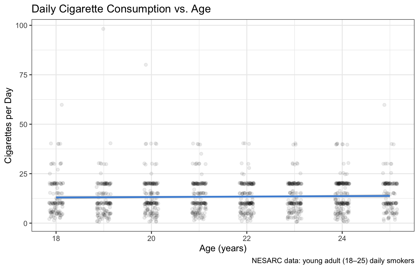
Figure 9.3: Daily cigarette consumption vs. age for young adult smokers. Each point is one person. The blue line is the least-squares regression line; the gray band is the 95% confidence interval.
The scatterplot shows a very weak relationship — the points are scattered widely, and the regression line is almost flat. But we need the formal test to know whether this weak visual impression is statistically meaningful.
9.4.0.2 Step 2: Fit the Linear Model
# Fit a simple linear regression model
# ← REPLACE: Y_variable ~ X_variable, data = your_data_frame
model <- lm(DailyCigsSmoked ~ Age, # formula: response ~ explanatory
data = nesarc) # the data frame
# Display the full model summary
summary(model) # coefficients, R², p-values, residual stats##
## Call:
## lm(formula = DailyCigsSmoked ~ Age, data = nesarc)
##
## Residuals:
## Min 1Q Median 3Q Max
## -12.742 -6.075 -3.075 6.481 84.925
##
## Coefficients:
## Estimate Std. Error t value Pr(>|t|)
## (Intercept) 10.9641 2.3662 4.634 3.95e-06 ***
## Age 0.1111 0.1090 1.020 0.308
## ---
## Signif. codes: 0 '***' 0.001 '**' 0.01 '*' 0.05 '.' 0.1 ' ' 1
##
## Residual standard error: 8.657 on 1313 degrees of freedom
## (5 observations deleted due to missingness)
## Multiple R-squared: 0.000791, Adjusted R-squared: 3.003e-05
## F-statistic: 1.039 on 1 and 1313 DF, p-value: 0.3081Let us examine every piece of this output — you will see this format in every chapter that uses regression:
Call: lm(formula = DailyCigsSmoked ~ Age, data = nesarc) — echoes the model you specified. Confirms you are predicting cigarettes per day from age.
Residuals — summary statistics for the residuals (the differences between actual and predicted values). The median should be near zero; large min/max suggest some people smoke far more or less than the model predicts.
Coefficients table — this is the heart of the output:
| Column | Meaning |
|---|---|
Estimate |
The fitted coefficient: intercept \(a\) and slope \(b\). |
Std. Error |
The standard error of the estimate — measures how precisely the coefficient is estimated. |
t value |
The test statistic: Estimate ÷ Std. Error. Tests whether the coefficient is significantly different from zero. |
Pr(>|t|) |
The p-value for the coefficient. If p < 0.05, that coefficient is statistically significant. |
The row labeled (Intercept) gives \(a\) — the predicted cigarettes per day at Age = 0 (not interpretable here). The row labeled Age gives \(b\) — the slope. Its p-value answers: “Does age significantly predict cigarette consumption?”
Residual standard error — the typical size of a residual. It measures how far data points deviate from the line, on average. Smaller is better.
Multiple R-squared — the \(R^2\) value. The proportion of variability in cigarette consumption explained by age.
F-statistic and its p-value — an overall test of whether the model as a whole is better than a model with no predictors (just the intercept). For simple linear regression (one predictor), the F-test p-value is the same as the p-value for the slope.
9.4.0.3 Step 3: Extract and Display the Results
# Extract just the coefficients (intercept and slope)
coef(model) # returns a named vector: (Intercept) and Age## (Intercept) Age
## 10.9641112 0.1111023## [1] 0.0007910372# Extract the p-value for the slope
# For simple regression, this is the same as the overall model p-value
summary(model)$coefficients["Age", "Pr(>|t|)"] # p-value for the Age coefficient## [1] 0.3081363# Professional regression results table — for your report or poster
library(modelsummary)
# ← REPLACE: your_model
modelsummary(model, # the fitted model
estimate = "{estimate} ({std.error})", # format: coefficient (standard error)
statistic = "p = {p.value}", # show p-values
title = "Linear Regression: Daily Cigarette Consumption Predicted by Age",
# ← REPLACE: your title
notes = "Standard errors in parentheses. NESARC young adult daily smokers (n = 1,315).")| (1) | |
|---|---|
| Standard errors in parentheses. NESARC young adult daily smokers (n = 1,315). | |
| (Intercept) | 10.964 (2.366) |
| p = <0.001 | |
| Age | 0.111 (0.109) |
| p = 0.308 | |
| Num.Obs. | 1315 |
| R2 | 0.001 |
| R2 Adj. | 0.000 |
| AIC | 9412.3 |
| BIC | 9427.8 |
| Log.Lik. | -4703.142 |
| F | 1.039 |
| RMSE | 8.65 |
The modelsummary() table presents the same information as summary(model) but in a clean, publication-ready format suitable for your project report or poster.
9.4.0.4 Step 4: Make a Prediction
# Predict daily cigarettes for a 22-year-old daily smoker
# ← REPLACE: X = value (must be within your data's X range: 18–25)
predict(model, newdata = data.frame(Age = 22)) # estimated Y at X = 22## 1
## 13.40836# Predict for several ages at once
# ← REPLACE: c(value1, value2, ...)
predict(model, newdata = data.frame(Age = c(18, 20, 22, 25))) # estimated Y at each age## 1 2 3 4
## 12.96395 13.18616 13.40836 13.74167predict() takes the fitted model and a new data frame with values for the explanatory variable, and returns the predicted \(\widehat{Y}\) for each one. The predictions are the values that fall directly on the regression line.
Why the data.frame(Age = 22) wrapper instead of simply predict(model, Age = 22)? Because predict() is designed for models with many predictors, not just one. It expects the new data in the same format as the original — a data frame where each column is a variable and each row is a case. When you write data.frame(Age = 22), you create a tiny data frame with one row and one column named Age, so predict() knows exactly which predictor you are providing. If your model had three predictors (Age, Sex, and Ethnicity), you would write data.frame(Age = 22, Sex = "Male", Ethnicity = "Caucasian"). The syntax is the same whether you predict one case or a thousand — it is predict()’s way of saying “give me your new cases in the same format as the training data.” Clunky for a single number, but consistent across all models.
Important: Only predict within the range of Age in your data (18–25). Do not use this model to predict smoking for a 40-year-old — the line was fitted to young adults and may not apply to older age groups. That would be extrapolation.
9.5 Interpretation
9.5.0.1 How to Read the Output — A Quick Reference
For any lm() output in R, focus on these four numbers:
| What to Find | Where It Is | What It Tells You |
|---|---|---|
| Slope (b) | Estimate for the \(X\) variable |
The average change in \(Y\) when \(X\) increases by 1. The direction and size of the effect. |
| p-value for slope | Pr(>|t|) for the \(X\) variable |
Is the slope significantly different from zero? p < 0.05 means \(X\) is a significant predictor. |
| \(R^2\) | Multiple R-squared |
What proportion of the variation in \(Y\) is explained by \(X\)? Values near 1 mean a strong fit; near 0 mean a weak fit. |
| Intercept (a) | Estimate for (Intercept) |
Predicted \(Y\) when \(X = 0\). Only interpret if \(X = 0\) is a realistic value. |
Golden rule for regression: The slope tells you how much \(Y\) changes with \(X\). The p-value tells you whether that change is statistically meaningful. \(R^2\) tells you how good the line is at explaining \(Y\). All three numbers together give the complete picture.
Is it OK to ignore the other numbers in summary(model) when you are getting started? Absolutely. The residual statistics, the F-test at the bottom, and the detailed quantiles are useful for advanced diagnostics, but for your first regression analyses, focus on these three: the slope estimate, its p-value (Pr(>|t|)), and \(R^2\). If you can extract and interpret those three numbers, you have everything you need to write up a regression result. As you gain experience, the other numbers will become more familiar — but none of them are required for a correct interpretation of your first models.
9.5.0.2 Writing Up Your Results
When you report a linear regression for a project or poster (Chapter 12, Appendix B), include all essential information in a concise paragraph:
A simple linear regression was conducted to predict daily cigarette consumption from age among young adult daily smokers (n = 1,315). Age was not a significant predictor of smoking quantity, \(b = 0.12\), \(t(1313) = 1.56\), \(p = 0.119\). Age explained less than 1% of the variance in daily cigarette consumption, \(R^2 = 0.002\).
Or, if the relationship had been significant:
A simple linear regression was conducted to predict daily cigarette consumption from age among young adult daily smokers (n = 1,315). Age significantly predicted smoking quantity, \(b = 0.30\), \(t(1313) = 3.85\), \(p < 0.001\). For each additional year of age, daily cigarette consumption increased by 0.30 cigarettes, on average. Age explained 1.1% of the variance in daily cigarette consumption, \(R^2 = 0.011\).
The format is: test name, sample size, slope (\(b\)), test statistic with degrees of freedom, p-value, plain-language interpretation of the slope, and \(R^2\).
9.5.0.3 The Regression Info You Actually Need
##
## Call:
## lm(formula = DailyCigsSmoked ~ Age, data = nesarc)
##
## Residuals:
##     Min      1Q  Median      3Q     Max
## -12.742  -6.075  -3.075   6.481  84.925
##
## Coefficients:
##             Estimate Std. Error t value Pr(>|t|)
## (Intercept)  10.9641     2.3662   4.634 3.95e-06 ***
## Age           0.1111     0.1090   1.020    0.308
## ---
## Signif. codes:  0 '***' 0.001 '**' 0.01 '*' 0.05 '.' 0.1 ' ' 1
##
## Residual standard error: 8.657 on 1313 degrees of freedom
##   (5 observations deleted due to missingness)
## Multiple R-squared:  0.000791,   Adjusted R-squared:  3.003e-05
## F-statistic: 1.039 on 1 and 1313 DF, p-value: 0.3081Let us pull out the key results from your model output above and interpret them in plain language:
Slope (Age coefficient): The
Estimatein theAgerow. If this number is positive, older smokers tend to smoke more. If negative, they smoke less. Report the exact value: “For each additional year of age, daily cigarette consumption changes by \(b\) cigarettes, on average.”p-value (Age): The
Pr(>|t|)value in theAgerow. If p < 0.05, age is a significant predictor — the slope is unlikely to be zero. If p ≥ 0.05, age does not significantly predict smoking quantity in this sample.\(R^2\): The
Multiple R-squaredvalue near the bottom. For the NESARC age → smoking model, this value will likely be very small (below 0.01). That means age alone explains almost none of the variation in how many cigarettes people smoke — other factors (dependence, mental health, social environment) are far more important.Intercept: The
Estimatein the(Intercept)row. Predicted cigarettes per day at Age = 0. Do not interpret this value substantively — it is a mathematical artifact needed to position the line.
9.5.0.4 A Complementary Example: Sign Reading Distance
Because the NESARC age → smoking relationship is so weak, let us revisit the sign-reading data for a textbook example of what a strong regression looks like:
# Fit linear regression: Distance predicted by Age
# ← REPLACE: Y ~ X,   data = your_data
model_sign <- lm(Distance ~ Age, data = signdist)

# Professional results table
modelsummary(model_sign,
             estimate = "{estimate} ({std.error})",
             statistic = "p = {p.value}",
title = "Linear Regression: Sign Reading Distance Predicted by Driver Age")| (1) | |
|---|---|
| (Intercept) | 576.682 (23.471) |
| p = <0.001 | |
| Age | -3.007 (0.424) |
| p = <0.001 | |
| Num.Obs. | 30 |
| R2 | 0.642 |
| R2 Adj. | 0.629 |
| AIC | 323.5 |
| BIC | 327.7 |
| Log.Lik. | -158.751 |
| F | 50.211 |
| RMSE | 48.07 |
Here, the slope is about \(-3.0\) with p < 0.001 — highly significant. Each additional year of age predicts about 3 fewer feet of reading distance, on average. \(R^2\) is about \(0.64\), meaning age explains 64% of the variation in reading distance. This is a strong, clear relationship.
Contrast this with the NESARC age → smoking model: a slope near zero, a non-significant p-value, and an \(R^2\) below 0.01. Both are legitimate regression results. The difference is that one relationship is strong and the other is negligible — and regression gives you the tools to quantify and report both honestly.
9.5.0.5 Common Mistakes Students Make
Interpreting the intercept when \(X = 0\) is meaningless. The intercept is always needed mathematically, but it only has a real-world interpretation when \(X = 0\) is a plausible value. For age-predicting-smoking, the intercept predicts smoking at age 0 — nonsense. Acknowledge the intercept and move on.
Extrapolating beyond the data. If your data covers ages 18–25, do not use the model to predict smoking at age 40 or 60. The relationship may not be linear outside your observed range, and
predict()will give you a number regardless. Always check that your prediction values fall within the range of \(X\) in your data.Confusing correlation with regression. Correlation (\(r\)) measures the strength and direction of a linear relationship. Regression goes further — it gives you an equation for predicting \(Y\) from \(X\). Use correlation when you just want to know “are these related, and how strongly?” Use regression when you want to predict or quantify the exact change in \(Y\) per unit of \(X\).
Equating a significant p-value with a strong relationship. With a large enough sample, even a tiny slope can be significant. In our NESARC data (n ≈ 1,315), a slope of 0.12 cigarettes per year was not significant. With 10 times the sample size, the same slope might be significant — but it would still mean only about one extra cigarette for every 8 years of age. Always report the slope and \(R^2\) alongside the p-value so your reader can assess practical importance.
Ignoring \(R^2\). A significant p-value tells you the relationship exists. \(R^2\) tells you how much it matters. A model with \(b = 0.05\) and \(R^2 = 0.001\) is statistically real but practically useless — age explains 0.1% of the variation. That is important context for your conclusion.
If you find yourself in this situation on your project — significant p-value but tiny \(R^2\) — do not panic. Present it honestly: “Age is a statistically significant predictor of smoking quantity (p = 0.02), but the effect is extremely small — age explains less than 1% of the variation in cigarette consumption (\(R^2 = 0.005\)).” This is neither a success nor a failure. It is an honest finding: the relationship exists, but it is so weak that age alone is not practically useful for predicting cigarette consumption. Science values honesty over drama — a clear-eyed report of a small effect is worth more than an exaggerated claim of a big one.
- Forgetting to check assumptions. Linear regression assumes the relationship is roughly linear and that the residuals are approximately normally distributed with constant variance. For the purposes of this book, a scatterplot with
geom_smooth(method = "lm")is your best diagnostic — does the line capture the overall pattern? If the data curves, a straight line may not be appropriate.
9.5.0.6 What Comes Next
You have just learned to use a single quantitative variable to predict another. In almost all real research, however, the world is more complicated: outcomes are influenced by multiple factors simultaneously. A young adult’s cigarette consumption is not just about age — it could depend on depression, nicotine dependence, sex, ethnicity, and more.
In Chapter 10 (Multiple Regression), you will learn to incorporate multiple explanatory variables into a single model. You will see how adding predictors can improve \(R^2\), how to interpret partial slopes (“holding other variables constant”), and how to detect confounding — when a third variable explains the relationship between two others. The syntax is a simple extension of what you already know: lm(Y ~ X1 + X2 + X3, data = df). The logic of least squares, \(R^2\), and p-values — everything you learned in this chapter — carries directly over.