Chapter 2 Univariate Analysis
2.1 TL;DR: Univariate Analysis
- Univariate analysis examines one variable at a time — its distribution, center, spread, and outliers.
- Categorical variable → frequency table with
table(), bar chart withggplot2 + geom_bar(). - Quantitative variable → histogram with
hist(), center withmean()ormedian(), spread withsd(). - Shape, center, spread are the three features that describe any quantitative distribution.
- Always load data first with
read.csv()— never type data by hand.
# Load ggplot2 for plotting
library(ggplot2)
# Load the dataset — students download this CSV to their project folder
epiduralf <- read.csv("epiduralf.csv") # ← REPLACE: path to your CSV
# Frequency table — how many observations in each group?
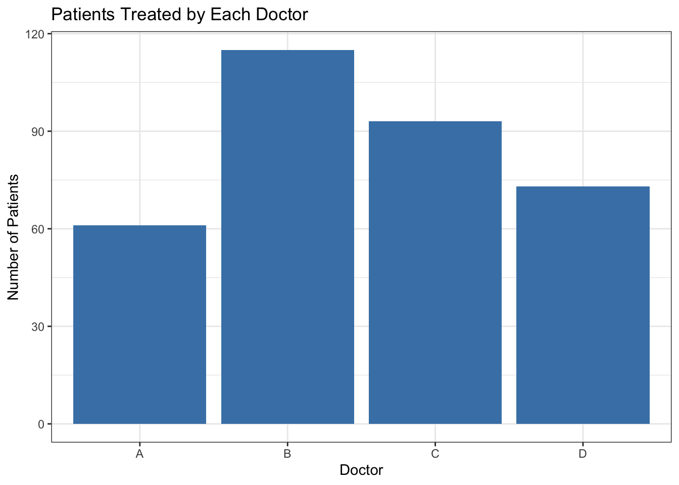
table(epiduralf$doctor) # ← REPLACE: your categorical variable##
## A B C D
## 61 115 93 73# Proportions — same information as fractions
prop.table(table(epiduralf$doctor)) # ← REPLACE: your categorical variable##
## A B C D
## 0.1783626 0.3362573 0.2719298 0.2134503# Bar chart — visual summary of the frequency table
ggplot(epiduralf, aes(x = doctor)) + # ← REPLACE: your categorical variable
geom_bar(fill = "steelblue") + # fill color of bars
theme_bw() + # clean black-and-white theme
labs( # labels for the chart
title = "Patients Treated by Each Doctor", # ← REPLACE: your title
x = "Doctor", # ← REPLACE: x-axis label
y = "Number of Patients" # ← REPLACE: y-axis label
)
# Same information as a clean table — use for reports
library(modelsummary)
datasummary(doctor ~ N + Percent(), # ← REPLACE: your variable
data = epiduralf) # ← REPLACE: your data frame| doctor | N | Percent |
|---|---|---|
| A | 61 | 17.84 |
| B | 115 | 33.63 |
| C | 93 | 27.19 |
| D | 73 | 21.35 |
# Load the dataset — students download this CSV to their project folder
soccer <- read.csv("soccer.csv") # ← REPLACE: path to your CSV
# Histogram — shows the distribution of values
hist(soccer$goals, # ← REPLACE: your quantitative variable
main = "Goals Scored in World Cup Matches (1990–2002)", # ← REPLACE: title
xlab = "Goals per Match", # ← REPLACE: x-axis label
col = "lightblue", # fill color of bars
border = "white") # border color of bars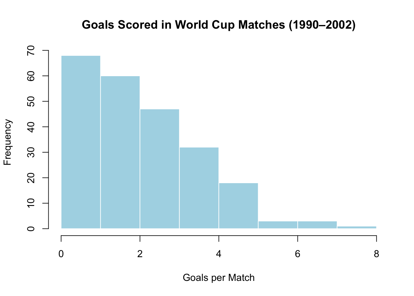
# Summary statistics — the numbers that describe the distribution
mean(soccer$goals) # ← REPLACE: average (sensitive to outliers)## [1] 2.478448## [1] 2## [1] 1.567931## Min. 1st Qu. Median Mean 3rd Qu. Max.
## 0.000 1.000 2.000 2.478 3.000 8.000# Same numbers, professional table — one line instead of five
library(modelsummary)
datasummary(goals ~ N + Mean + Median + SD + Min + Max, # ← REPLACE: your variable
data = soccer) # ← REPLACE: your data frame| N | Mean | Median | SD | Min | Max | |
|---|---|---|---|---|---|---|
| goals | 232 | 2.48 | 2.00 | 1.57 | 0.00 | 8.00 |
Key interpretation: The World Cup goals distribution is skewed right — most matches have 0–3 goals, with a long tail of high-scoring games. The median (2) is less affected by rare blowouts than the mean (2.48). The standard deviation of about 1.57 means a typical match is about 1.57 goals away from the mean.
2.2 Deep Dive: Univariate Analysis
2.2.1 What Is Univariate Analysis?
The word univariate comes from “uni” (one) and “variate” (variable). Univariate analysis is the act of examining one variable at a time — its distribution, its center, its spread, and any unusual patterns.
Think of it as getting to know your data, one variable at a time. Before you can ask whether two variables are related (Chapter 4), you need to understand each variable on its own. A doctor does not jump straight to asking whether cholesterol level predicts heart disease — she first checks: What is the range of cholesterol levels in this group of patients? How spread out are they? Are there extreme values that might skew the results?
The same discipline applies to your research project. Before you run any test, look at each of your major variables alone and ask:
- What does a typical value look like?
- How much do the values vary?
- Is the distribution symmetric, or is it skewed?
- Are there any outliers that deserve attention?
2.2.2 One Categorical Variable
A categorical variable places each observation into a group. Favorite subject, smoking status (Yes/No), and blood type are all categorical. To analyze a categorical variable, you count how many observations fall into each group.
Here is the core recipe — the same code you saw in the TL;DR, now explained line by line.
# Load ggplot2 for plotting
library(ggplot2)
# Load the dataset from a CSV file
epiduralf <- read.csv("epiduralf.csv")The epiduralf dataset comes from a real medical study. Four doctors (labeled A, B, C, D) administered epidural anesthesia to 342 patients. The variable doctor tells you which doctor treated each patient — a categorical variable with four groups.
2.2.2.1 Frequency Tables
A frequency table lists each category and the number of observations in it:
##
##   A   B   C   D
## 61 115 93 73table() takes a variable and counts how many times each value appears. Here, Doctor B treated 115 patients, Doctor C treated 93, Doctor D treated 73, and Doctor A treated 61. The total is 342 — always check that your counts add up.
2.2.2.2 Proportions
Raw counts are useful, but proportions let you compare across datasets of different sizes:
# Convert counts to proportions (fractions of the total)
prop.table(table(epiduralf$doctor)) |>
  round(3)
##
## A B C D
## 0.178 0.336 0.272 0.213prop.table() divides each count by the total. The |> symbol (called the “pipe”) chains two operations together: take the proportions, then round them. It reads left-to-right — prop.table(...) |> round(3) means “compute the proportions, then pass the result to round().” You type it with two keystrokes: a vertical bar | (usually Shift + backslash) followed by a greater-than >. round(3) keeps three decimal places so the numbers are readable. Now you can say: Doctor B treated 33.6% of the patients, Doctor C treated 27.2%, Doctor D treated 21.3%, and Doctor A treated 17.8%.
2.2.2.3 Bar Charts
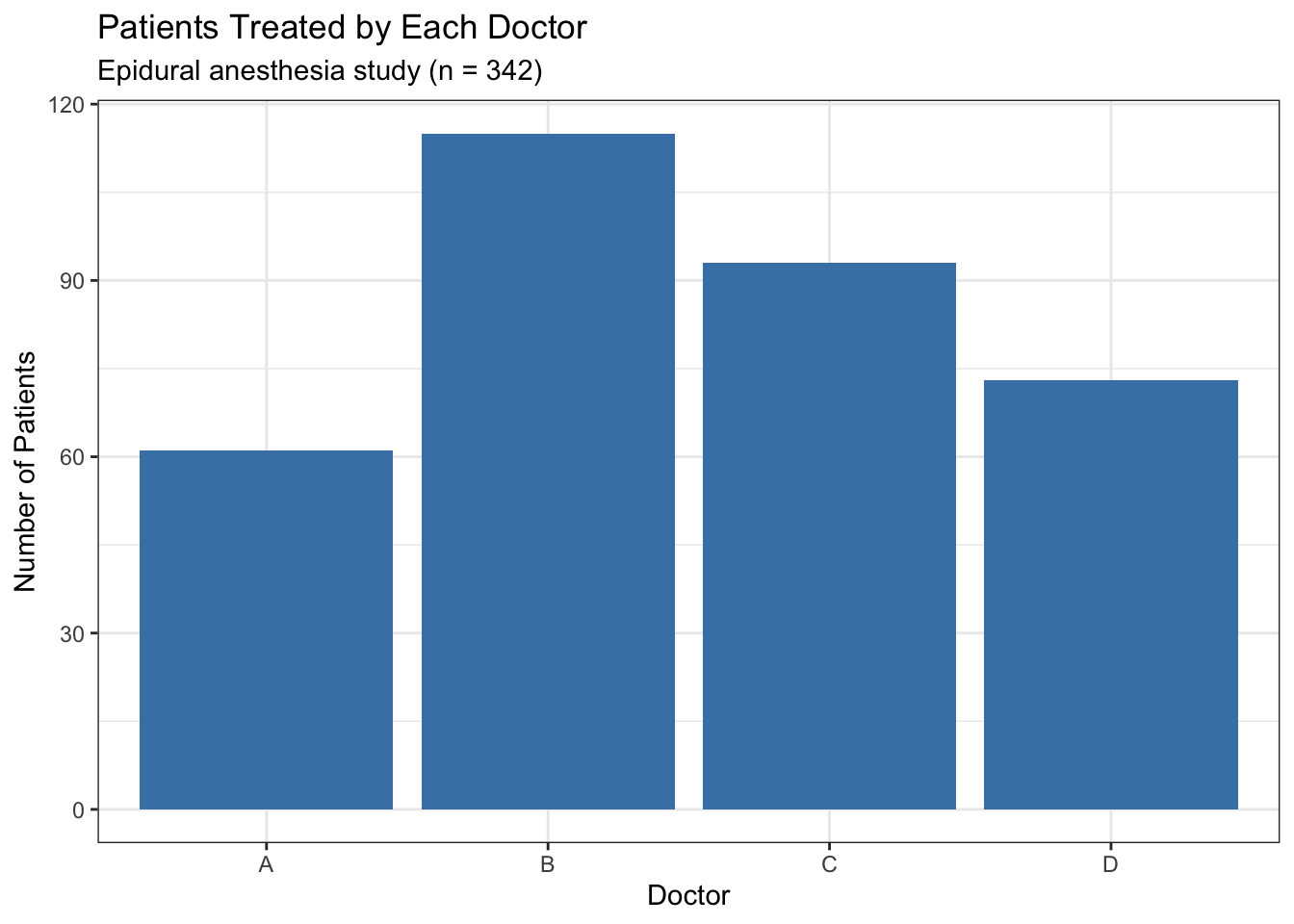
A bar chart visualizes the frequency table. Each bar represents one category; the height shows the count or proportion:
# Build the bar chart layer by layer
ggplot(epiduralf, aes(x = doctor)) +    # tell ggplot which variable to plot
  geom_bar(fill = "steelblue") +        # draw the bars with a steelblue fill
  theme_bw() +                          # apply a clean black-and-white theme
  labs(                                 # add labels
    title    = "Patients Treated by Each Doctor",
    subtitle = "Epidural anesthesia study (n = 342)",
    x        = "Doctor",
    y        = "Number of Patients"
  )
aes() is short for “aesthetics” — it is where you tell ggplot2 which variables map to which visual features. aes(x = doctor) means “put the doctor variable on the x-axis.” If you wanted to color each bar by doctor, you would write aes(x = doctor, fill = doctor). Everything inside aes() connects a column of your data to a part of the plot.
When you look at a bar chart, ask:
- Which bar is tallest? (The most common category — here, Doctor B.)
- Which bar is shortest? (The least common — here, Doctor A.)
- Are the bars roughly even, or does one category dominate?
- Is any category empty? (No bar means zero observations — worth investigating.)
In this chart, Doctor B’s bar is visibly taller than Doctor A’s. The doctors did not treat equal numbers of patients — something to note before comparing their outcomes.
2.2.2.4 From Raw Output to Professional Tables
Now you know how to compute frequencies and proportions one step at a time with table() and prop.table(). But when you write up results, you want all those numbers in one clean table. The modelsummary package does exactly that — same numbers, professional format:
# Load the package (install once with install.packages("modelsummary"))
library(modelsummary)

# One line produces the same table you built in three steps above
datasummary(doctor ~ N + Percent(),
data = epiduralf)| doctor | N | Percent |
|---|---|---|
| A | 61 | 17.84 |
| B | 115 | 33.63 |
| C | 93 | 27.19 |
| D | 73 | 21.35 |
Compare this to the earlier output. The counts match table(). The percentages match prop.table() (rounded). The difference is presentation: this table belongs in a report.
How the formula works: The ~ symbol (called a “tilde,” pronounced “TILL-duh”) is R’s way of writing formulas. You read doctor ~ N + Percent() as “for the variable doctor, show the count (N) and the percentage (Percent).” It separates what you are describing (left of ~) from how you want to describe it (right of ~). You will see ~ throughout this book — it appears in regression models, hypothesis tests, and anywhere you specify a relationship between variables.
2.2.3 One Quantitative Variable
A quantitative variable takes numeric values that represent meaningful amounts — test scores, heights, ages, goals per match. When you analyze a quantitative variable, you cannot count categories (there would be too many). Instead, you look at the distribution — how the values are spread across their range.
Here is the core recipe from the TL;DR, explained:
# Load the dataset from a CSV file
soccer <- read.csv("soccer.csv")

# Histogram — compress hundreds of data points into one picture
hist(soccer$goals,
     main   = "Goals Scored in World Cup Matches (1990–2002)",
     xlab   = "Goals per Match",
     col    = "lightblue",
     border = "white")
# The numbers that describe the distribution
mean(soccer$goals)    # the average: sum all values, divide by count
## [1] 2.478448## [1] 2## [1] 1.567931## Min. 1st Qu. Median Mean 3rd Qu. Max.
## 0.000 1.000 2.000 2.478 3.000 8.000The soccer dataset contains 232 World Cup matches from 1990 to 2002. Each row records the number of goals scored in a match. Let’s interpret each piece:
mean(soccer$goals)= about 2.48. The average match has about 2.5 goals.median(soccer$goals)= 2. Half of all matches have 2 or fewer goals.sd(soccer$goals)= about 1.57. On average, a match is about 1.57 goals away from the mean.summary(soccer$goals)gives you the minimum (0), the three quartiles, the median, the mean, and the maximum (8) in one line.
You will use summary() throughout this book as your first look at any quantitative variable.
You may have noticed that we used hist() for the histogram — a single, simple function — while the bar chart required a layer-by-layer build with ggplot2. The reason is practical: base R provides a quick, no-fuss hist() that works well for exploring data, which is exactly what univariate analysis is about. ggplot2 can make histograms too — try ggplot(soccer, aes(x = goals)) + geom_histogram(binwidth = 1, fill = "lightblue", color = "white") + theme_bw() — and in later chapters you will use ggplot2 for all your plots. For now, hist() gets you to insight faster.
2.2.3.1 From Individual Calls to One Clean Table
You just computed the mean, median, and SD in four separate lines. When you present results in a report, you want all those numbers side by side in one table. The datasummary() function from modelsummary does exactly this:
library(modelsummary)

# All five summary statistics in one table
datasummary(goals ~ N + Mean + Median + SD + Min + Max,
data = soccer)| N | Mean | Median | SD | Min | Max | |
|---|---|---|---|---|---|---|
| goals | 232 | 2.48 | 2.00 | 1.57 | 0.00 | 8.00 |
Every number matches what you computed above with mean(), median(), sd(), and summary(). The difference is presentation: this table is ready to paste into a report.
How the formula works: The part before the ~ is the variable you want to summarize (goals). After the ~, you list the statistics to compute — N (count), Mean, Median, SD, Min, Max. This formula pattern — variable ~ stat1 + stat2 + stat3 — is consistent across modelsummary and will appear again in later chapters.
2.2.3.2 The Histogram
To understand how a histogram works, let’s build one by hand. Here are exam scores for 15 students:
88, 48, 60, 51, 57, 85, 69, 75, 97, 72, 71, 79, 65, 63, 73Divide the range into 10-point bins (40–50, 50–60, …, 90–100) and count how many scores fall into each:
| Score Interval | Number of Students |
|---|---|
| [40,50) | 1 |
| [50,60) | 2 |
| [60,70) | 4 |
| [70,80) | 5 |
| [80,90) | 2 |
| [90,100) | 1 |
Now draw a rectangle over each bin with height equal to the count:
hist(exam,
     right  = FALSE,
     breaks = seq(40, 100, by = 10),
     main   = "Histogram of Exam Scores",
     xlab   = "Score",
     col    = "lightblue",
     border = "white")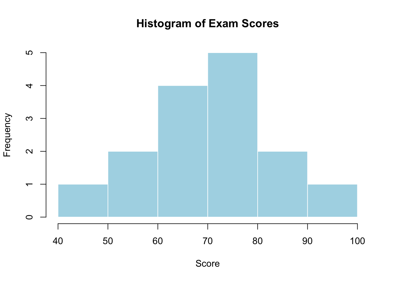
Each bar corresponds to one row of the table above. The tallest bar is 70–80 (5 students), the shortest are 40–50 and 90–100 (1 student each).
When you call hist() without specifying bin widths — like hist(soccer$goals) earlier — R chooses the number of bars automatically. It tries to pick a reasonable width, but you can override it with the breaks argument. For example, hist(soccer$goals, breaks = 15) forces about 15 bars. breaks = seq(0, 8, by = 1) forces bars exactly 1 goal wide. The control is yours.
Why not just look at the raw numbers? Scanning 15 numbers is easy. Scanning 232 (the soccer data) is tedious. Scanning 43,000 (the NESARC dataset) is impossible. A histogram compresses any number of data points into a visual snapshot you can read in seconds.
2.2.3.3 Shape, Center, and Spread
Once you have a histogram, describe it using three features:
Shape — what does the distribution look like?
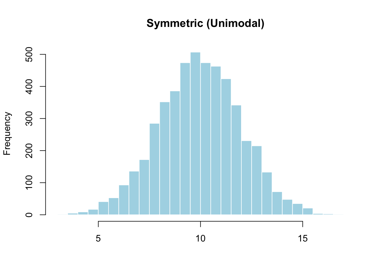
- Symmetric: Left and right sides are roughly mirror images.
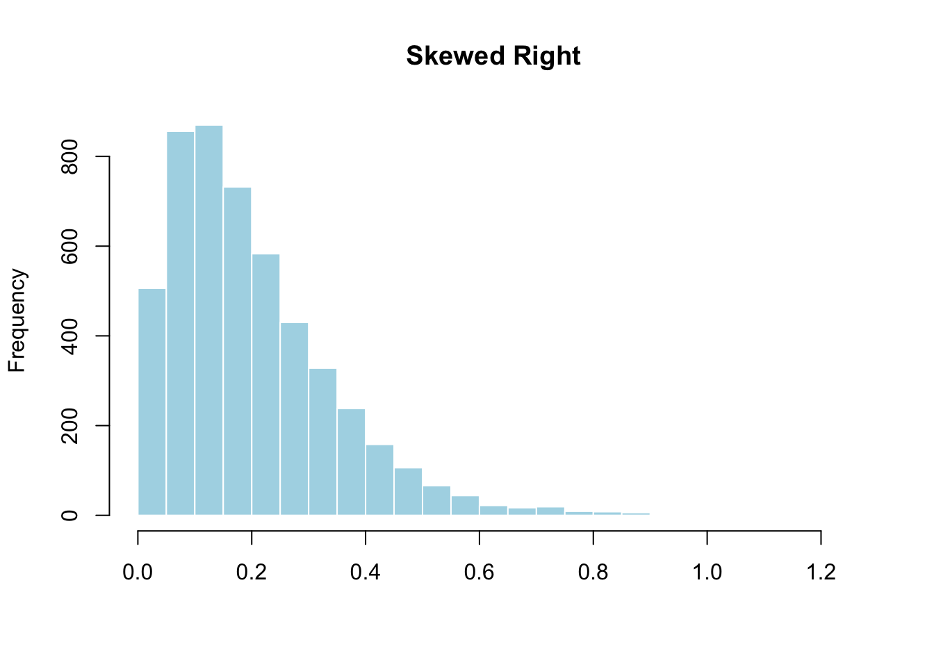
- Skewed right: The right tail is longer than the left. Most values cluster on the left with a few far to the right. Salary data looks like this (most people earn moderate amounts; a few earn millions). The World Cup goals data is skewed right — most matches are low-scoring, but a few have 6, 7, or 8 goals.
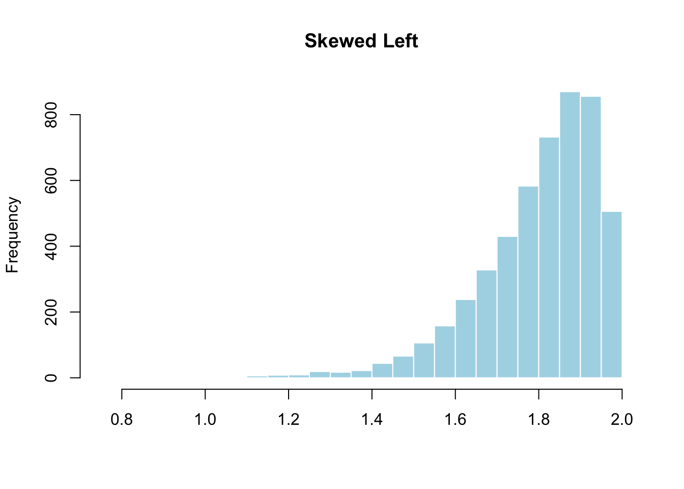
- Skewed left: The left tail is longer. Most values cluster on the right. Age at death from natural causes is skewed left — most people live to old age, but some die young.
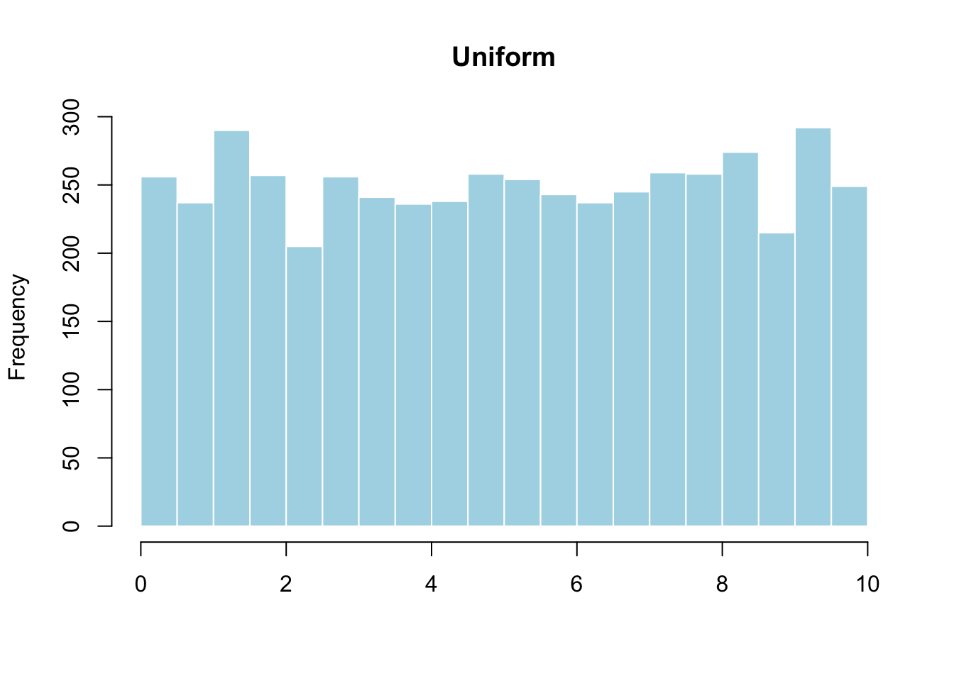
- Uniform: All values appear with roughly equal frequency. The distribution looks flat.
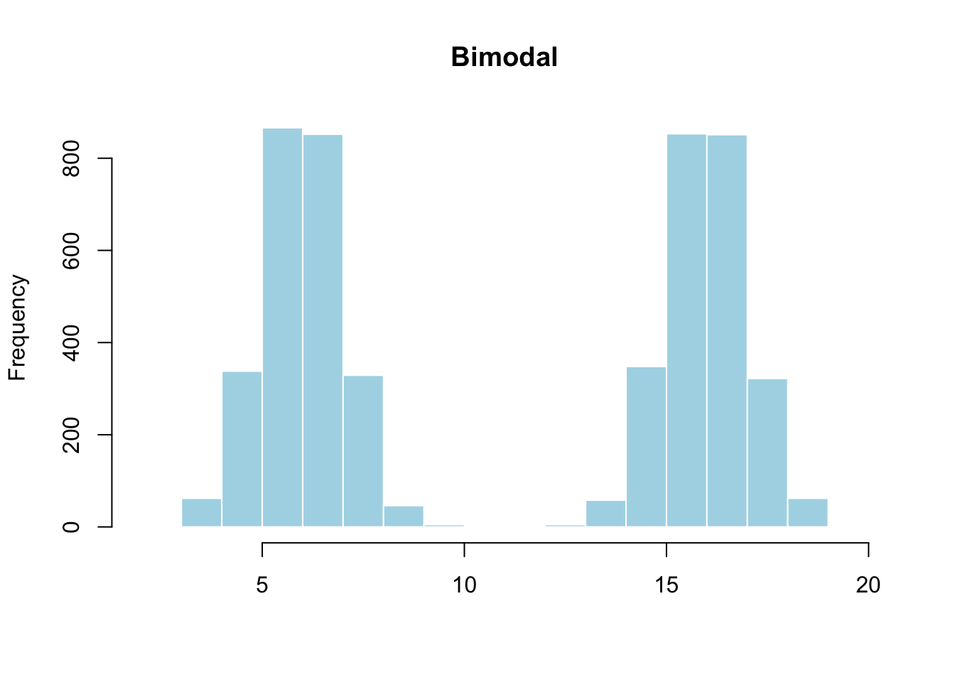
- Bimodal: Two peaks. This often means the data contains two distinct subgroups. If you plotted heights of all students in a K–12 school, you would see one peak for elementary students and another for high school students.
Center — where is the midpoint? The center is the value that divides the data roughly in half. In the exam scores histogram, the center looks to be around 70.
Spread — how far do the values range? Look at the minimum and maximum on the x-axis. In the exam scores, the spread runs from roughly 48 to 97. A wider spread means more variability.
2.2.4 Measures of Center
Eyeballing the center from a histogram gives a rough idea. To describe it precisely, use the mean or the median.
2.2.4.1 Mean
The mean (often called the average) is the sum of all observations divided by the number of observations. If your data are \(x_1, x_2, \ldots, x_n\):
\[\bar{x} = \frac{x_1 + x_2 + \cdots + x_n}{n}\]
The symbol \(\bar{x}\) is pronounced “x-bar.”
Returning to the soccer data:
# Compute the mean by hand
sum_goals <- sum(soccer$goals)   # add up every goal
n_matches <- length(soccer$goals) # count how many matches
sum_goals / n_matches             # divide to get the average
## [1] 2.478448## [1] 2.478448The mean is about 2.48. Intuition: if all goals were evenly distributed across matches, each match would have about 2.48 goals. The mean “levels out” the data.
2.2.4.2 Median
The median (denoted \(M\)) is the middle value. Half the observations are below it, half above.
To find the median: (1) sort the data, (2) if \(n\) is odd, take the middle; if \(n\) is even, average the two middle values.
## [1] 2# To see how it works: sort the values and find the middle positions
n <- length(soccer$goals) # 232 — an even number
goals_sorted <- sort(soccer$goals)
goals_sorted[n/2] # position 116 → value is 2## [1] 2## [1] 2The median is 2 goals. Half of all matches in this dataset had 2 or fewer goals.
2.2.4.3 Mean vs Median: Why It Matters
Consider two datasets of test scores:
- Class A: 64, 65, 66, 68, 70, 71, 73 (7 students, no outliers)
- Class B: 64, 65, 66, 68, 70, 71, 730 (one student scored 730?)
A <- c(64, 65, 66, 68, 70, 71, 73)
B <- c(64, 65, 66, 68, 70, 71, 730)

c(mean(A), mean(B), median(A), median(B))
## [1] 68.14286 162.00000 68.00000 68.00000For Class A, the mean (68.1428571) and median (68) are close — the distribution is symmetric with no outliers.
For Class B, the median stays at 68. But the mean jumps to 162 — the single outlier of 730 drags the average so far up that it no longer describes a typical student.
| If the distribution is… | Then use… |
|---|---|
| Symmetric, no outliers | Mean |
| Skewed or has outliers | Median |
The mean is sensitive to outliers; the median is resistant to them.
This is why news reports say “median household income,” not “mean household income.” A handful of billionaires would pull the mean far above what a typical family earns. The median tells the honest story.
Now apply this to the soccer data: the mean is 2.48, but the median is 2. The mean is pulled right by rare high-scoring matches. The median better describes a typical World Cup match.
2.2.5 Measures of Spread
Center alone is incomplete. Look at these two distributions — same center, wildly different spread:
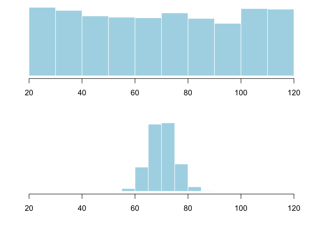
If you only reported the mean, the reader would think these classes are identical. You need a measure of spread (also called variability or dispersion).
2.2.5.1 Range
The range is the distance from the smallest observation to the largest:
\[\text{Range} = \text{Max} - \text{Min}\]
## [1] 0 8## [1] 8The range of goals is 8 (from 0 to 8). The range is easy, but fragile — one extreme match makes it 8 even if every other match had 1–3 goals. The range is a starting point, not your final word.
2.2.5.2 Standard Deviation
The standard deviation (SD) answers: on average, how far is each observation from the mean?
Here is the full calculation on a small example. Eight consecutive hours of customers entering a bookstore:
7, 9, 5, 13, 3, 11, 15, 9- Find the mean: \((7 + 9 + 5 + 13 + 3 + 11 + 15 + 9) / 8 = 9\)
## [1] 9- Find each deviation from the mean (value minus mean):
## [1] -2 0 -4 4 -6 2 6 0Positive = above the mean. Negative = below. The sum of all deviations is always zero — that is why you cannot simply average them.
- Square each deviation (makes them all positive, amplifies larger deviations):
## [1] 4 0 16 16 36 4 36 0- “Average” the squared deviations — divide by \(n - 1\) (here, \(8 - 1 = 7\)) instead of \(n\). This is the variance:
## [1] 16(Why \(n - 1\)? The short answer: dividing by \(n - 1\) gives an unbiased estimate of the population variance. More on this in later chapters.)
- Take the square root to return to the original units (customers, not squared customers):
## [1] 4In practice, use sd():
## [1] 4Interpretation: On average, the number of customers in a given hour is about 4 away from the mean of 9. Most counts fall between 9 − 4 = 5 and 9 + 4 = 13.
You might wonder: why square the deviations only to take a square root at the end? Why not just drop the negative signs (take the absolute value) and average those distances? You absolutely could — that is called the mean absolute deviation, and it is a perfectly valid measure of spread. Statisticians prefer the standard deviation because squaring gives extra weight to values far from the mean (useful for detecting outliers) and because it has elegant mathematical properties that make it the foundation of almost all advanced methods. But your instinct is right: both measures capture the idea of “typical distance from the mean.”
2.2.5.3 Interpreting the Standard Deviation
Now apply this to the soccer data:
## [1] 1.567931The SD is about 1.57 goals. A typical match is about 1.57 goals away from the mean of 2.48 — consistent with the histogram showing most matches in the 0–4 range.
A useful rule of thumb for roughly symmetric data:
| Interpretation | Approximate Coverage |
|---|---|
| Mean ± 1 SD | About 68% of the data |
| Mean ± 2 SD | About 95% of the data |
| Mean ± 3 SD | Nearly all of the data |
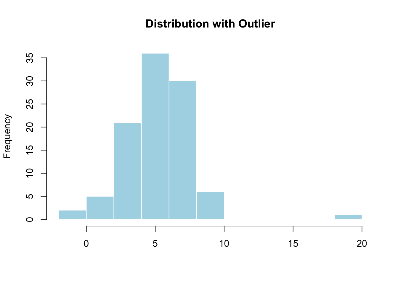
A value more than 3 SD from the mean deserves a closer look — it might be an outlier.
This pattern is called the 68–95–99.7 rule (often shortened to the 68–95 rule). It describes how data spreads in a symmetric, bell-shaped distribution. Keep this name in mind — you will hear it throughout statistics.
2.2.6 Common Mistakes Students Make
Describing center without spread. “The mean is 72” is half the story. Always pair center with spread.
Using the mean for skewed data. If your histogram shows a long right tail, report the median. The mean will mislead.
Confusing frequency with value on a histogram. The x-axis shows the values; the y-axis shows how common each value is. A tall bar means the value is common, not important.
Ignoring outliers without investigation. Investigate before you delete. An outlier might be your most interesting data point.
Treating the 68–95 rule as a rigid law. It works well for symmetric data and poorly for skewed data. Use it as a guide, not a rule.
Forgetting axis labels. A graph without labels is unreadable. Always include
main,xlab, and (forggplot2)labs().
2.2.7 What Comes Next
You now have the vocabulary to describe any single variable: its shape, center, spread, and outliers. For categorical variables: frequency tables and bar charts. For quantitative: histograms and the mean/median/SD.
But real data is rarely clean. In Chapter 3 (Data Management), you will learn to load the NESARC dataset, recode missing values, filter rows, select columns, and prepare your data for every chapter that follows.